The Adobe Originals Silver Anniversary Story: A community perspective on the Originals program
This is the ninth in a series of articles from Tamye Riggs, a longtime lover of type who is working with us to celebrate the twenty-fifth anniversary of the Adobe Originals type design program. In this post, typographers and type designers discuss how they were introduced to the Originals, and the impact of the program on the world of communications and their own work.
The first digital versions of the classic typefaces like Bodoni, Garamond, Caslon, Jenson, et al, were pretty bad. Done in a hurry with primitive tools. The classics from Berthold were better than most others and became part of the Adobe library pretty early. But even those didn’t have complete character sets, didn’t offer enough features like old style figures, let alone Greek or Cyrillic. Robert Slimbach is a genius, and John Warnock’s willingness to indulge him and the other designers at Adobe to go back to the sources and re-imagine what the old guys would have done with our tools put Adobe at the front of typographic development in the 1990s.
— Erik Spiekermann, Founder and Partner, FontShop International, Edenspiekermann
It’s been funny this whole time to hear people say, oh, bitmaps will die, bitmaps are going away, because there is PostScript now. Hinting will die, because all these screens are going to get sharper. So now the challenge is that … we don’t even know what the output quality is. It makes you realize it’s sort of like the specialization of any set of tasks for a process or industry; what’s it like to design aircraft or to be a car engineer now. If you open the cars built in every decade of the twentieth century, they just get more and more complicated. Open the hood of a 2014 model — it’s intimidating. There are so many systems there. You can’t be a mechanic and fix them. They’re electronic, they’re digital, there are sensors you can’t fix. Same as type anymore. When digital tools came out, I was so excited! I can do everything: test, blow up, down, check it, doing great, and just be satisfied with that. It takes a lot more now. A font has so much more in it.
— Carl Crossgrove, Senior Type Designer for Monotype
Born as a result of the intense atmospheric shifts of the desktop publishing revolution of the mid-1980s, the Adobe Originals program, and the heightened typographic standards set by Adobe, had a profound effect on both makers and users of type. Adobe served as the go-to source of quality typefaces for discerning typographers, while raising the bar for creatives and technologists entering the world of digital type design.
After some of Adobe’s active designers discussed the Originals program in the previous chapter of this series, professionals from the type and design community were given the opportunity to share their views. For frame of reference, those interviewed were also asked to describe how they fell into type and design in the first place.
Jim Parkinson
Type Designer/Lettering Artist, Parkinson Type Design
typedesign.com
Adobe Originals Typefaces: Jimbo, Mojo, and Montara
How did you become interested in type and design?
“When I was really little — seven or eight years old — in Richmond, California, there was this old man (but maybe he was only in his thirties or something). He lived across the alley from us — he had a room in his house, and he did showcard lettering for department stores, for graduation diplomas and stuff. I would go to his studio and sit for hours and watch him work.
“He was pretty entertaining. He had a show he did, entertained at birthday parties. He would letter upside-down and backwards, turn numbers upside-down and there would be letters. Trick lettering! From then on, I always had an affection for it.
“When I graduated from art school at CCAC (now California College of the Arts), there weren’t any kind of jobs. You’d have to get a job sharpening pencils, getting coffee, maybe eventually cutting rubyliths … so I got a job at Hallmark in Kansas City. I talked to a recruiter on campus and I went out there and was in this thing called the ‘new artists group.’ They give you projects to figure out where they’re going to place you. At one point, they said, you’re just not working out, you’re just not greeting card material. The guy said, we might be able to find a spot in the lettering department if you might be interested in that. Like it was purgatory or something! Then I met this guy called Myron who taught me how to design for film type, met Hermann Zapf, … I started out not being good enough for greeting cards to having an affinity for type and lettering.”
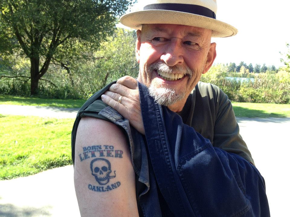
Jim Parkinson at a Bay Area typophiles picnic in Oakland’s Temescal Park, October 2012. Photo by Jesse Ragan.
How did you get involved as one of the external designers for the Adobe Originals program?
I think what got me involved with Adobe in the first place was the consulting team of Roger Black working with Adobe Type. I had worked with Roger so much, otherwise, I don’t know how they would have heard of me. Before the internet, you’re just alone in a room and the telephone never rings.
“I live in Oakland. Fred Brady and two other people from Adobe came to my house one day. They knocked on my front door. They brought me a computer, a Macintosh with a special font-specific version of Adobe Illustrator, pre-Fontographer. I spent like a week trying to learn how to draw a sans serif cap. I couldn’t do anything. I didn’t even know how it worked.
“Nothing ever came of that, and eventually they came and got the computer. But later, once I learned how to use Fontographer, I did these little speculative type specimen books I’d send out to people. I phoned them [Adobe] up; they were still up in Mountain View or wherever they were. They said, come on down, let’s have lunch. So different compared to how it is today.
“So I printed out a bunch of these little type specimen books and we sat down in a conference room. Everybody looked at them and said what they wanted, and I got my first couple of type jobs out of that. They were extraordinarily anal about things. I have a couple of little samples I print out to test my fonts, but they print out big thick 3-ring binders full. They sent me like two binders of printouts of every size: upside-down and backwards and everything. They might have thought they were raking me over the coals, but they were really raking themselves over the coals! In the end, there were just a few corrections out of all that. The same corrections were on every sheet. It wasn’t bad.
“Once they decided to go with a typeface [Jimbo], Linnea Lundquist was my first liaison. Jocelyn Bergen was the liaison for Montara. So you don’t have to keep going back in and keep dealing with Robert [Slimbach] or Carol [Twombly] or anybody. Once they say OK, you don’t have to go down and sit in the office and listen to it, they just send it to you. It was all pretty painless. And, of course, I came from three decades of pen and ink, so anything I did on the computer was like coasting. It was so much easier than lettering. They might have thought I was working really hard, but I thought, how can people pay you this much to just play around? It was crazy.”
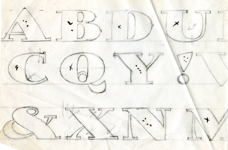
Sketches for Jimbo, an Adobe Original designed by Parkinson and published in 1995.
Parkinson’s personal hand lettered logo, an ancestor of Jimbo.
What is your favorite typeface design from the Adobe Originals collection?
“Robert Slimbach did a thing called Adobe Jenson. I think it’s because I’m familiar with Jenson typefaces and have done things myself reminiscent of Jenson typefaces. I like what he did with it. They published a little catalog with all kinds of information about it. It was nice that somebody who had a sensitivity towards real type and type history set the bar high enough so that the type industry didn’t just die because it was done by a bunch of teenagers. Somebody had to say, there’s something to this … let’s do it right. I think they’re one of the companies that led that.”
How do you feel the Adobe Originals program has contributed to type and design?
“I think what happened at Adobe was they invented PostScript, and they figured out the best way to sell it was to make type with it, and they had their type department selling PS like crazing by selling fonts like crazy. All the type was the little blossom that came from PostScript.
“A lot of times, technology accidentally causes people to do good things, like PostScript and the whole type revolution. It wasn’t done by artists — it was done by engineers who said, we can make these dots connect and fill in. I worked for a long time at the San Francisco Chronicle. I spent a lot of time in the newspaper industry, and a lot of times it was because the newspaper was replacing presses they used, so the type and logos needed to be redesigned to fit a narrower page. Not because it looks good — because it didn’t fit any more. A lot of good design doesn’t come from visionary designers; it comes from technicians who have thought of a better way to do it.”
Allan Haley
Director of Words and Letters, Monotype
monotype.com
How did you become interested in type and design?
“I’ve been a designer — a least a ‘drawer’ — since I can remember. When I entered college, I had to make course/career choices, and graphic design seemed to be a natural. I was very fortunate that the college had a printing press, hand-set type, and a professor that was a true typophile. My senior projects all contained hand lettering, and my first job out of school was as an apprentice typesetter at a local ‘type house’ — and that began my life in type.”
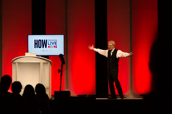
Monotype’s Allan Haley talks typographic mastery at the HOW design conference in Boston, May 2014.
How have type and typography most impacted your life?
“They are wonderful and complex endeavors — that allowed me to grow and find my own way in my career. I knew pretty early on that I was not going to be much more than an average type designer, but there are so many other things that make up the typographic arts — and our community — that I could change and continue to grow over the years. I like to say that I have the second best job in the typographic arts. (Matt Carter has the best.)”
When did you first become aware that Adobe had an original typeface design program?
“I knew of the Adobe Originals program very early on. ITC [International Typeface Corporation] was the first ‘type company’ that Adobe worked with, and I had known Sumner Stone for several years before he went to work for them. It was a terrific idea that almost instantly made Adobe a player in the type community. My hat’s off to Sumner for doing such a smart thing so well.”
What is your favorite typeface design from the Adobe Originals collection?
“Of course, Adobe Garamond. Robert Slimbach did such a wonderful job in researching and designing the family. I also have a great fondness for Adobe Caslon. It stands out as one of — if not the — best example of the Caslon design in the decades before and since its release. It’s pushing the quarter-century mark, but it is still fresh. Many have complained that the original Caslon, while a distinctive milestone, was peppered with inelegant characters. Carol Twombly’s interpretation gives the design a sophisticated grace, with no loss of the original’s personality.”
How do you feel the Adobe Originals program has contributed to type and design?
“While faces like Quake and Giddyup may not be ‘important faces for our time,’ the Adobe Originals is a typographic resource that is deep, rich, and wide. Many of the designs have become staples of graphic communication.”
What do you see for the future of the program?
“If the decision were mine, I would reinvest in the program, reach out to more type designers, develop more original designs, and add to the families that would benefit from additional weights and proportions.”
Jessica Hische
Letterer/Type Designer
jessica.is/awesome
Follow @jessicahische on Twitter
How did you become interested in type and design?
“I really fell in love with design and type in college, and learning about it made me realize how much I’d always appreciated good design and typography. (I had definitely bought a number of records and books specifically because of the crazy lettering on the covers.) My love of art became more distilled and specific the more I learned, until I found myself in the niche industry of lettering.”
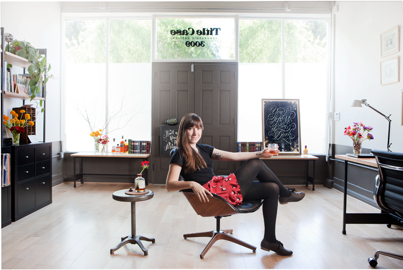
Jessica Hische at the Title Case offices in San Francisco. Photo by John Madere.
How have type and typography most impacted your life?
“I never thought that drawing letters for a living would enable me to travel all over the world educating people about lettering and type! Creating type can be a pretty solitary activity, but I’ve found that it’s enabled me to not only travel, but to meet amazing people that also love letters as much as I do.”
When did you first become aware that Adobe had an original typeface design program?
“I believe in school, mostly because of the naming system of the typefaces released (like Adobe Garamond).”
Have you ever had the opportunity to use typefaces from the Adobe Originals collection?
“Of course! While every generation of art students has its go-to typeface, my generation’s was definitely Rosewood. Every single portfolio in the few years surrounding my graduation (2006) had at least one piece using Rosewood. Birch was another big hit among my peers in my early twenties. I teach a lettering workshop and use Adobe Caslon as the base font for it — I make my students draw the ‘H’ and ‘O’ after looking at it for a few seconds and then guess what the rest of the letters look like — and we used Juniper on a branding project while I worked for Louise Fili. There are probably dozens of other times I’ve used Adobe Originals fonts in one way or another.”
The Title Case website uses Garamond Premier web fonts.
What is your favorite typeface design from the Adobe Originals collection?
“There are so many! If I had to choose, though, it might be Adobe Garamond, Chaparral, and Bickham Script (which isn’t really my style, but Richard Lipton is just so talented).
“I don’t have a favorite font, but I do have several favorite type designers (like having a favorite fashion designer instead of having a favorite dress — if I have a favorite dress, I wear it until it’s threadbare, but if I have a favorite designer I can go back for more and have a more varied wardrobe). Even when perusing the Adobe Originals collection, I found myself gravitating toward certain designers whom I know created other typefaces I like.”
John Hudson
Type Designer, Tiro Typeworks Ltd.
tiro.com
Follow @TiroTypeworks on Twitter
Adobe Originals Typefaces: Adobe Arabic, Adobe Devanagari, Adobe Hebrew, and Adobe Thai
How have type and typography most impacted your life?
“The ability to make a living doing something that I find interesting and rewarding. I read an interview with Matthew Carter recently, in which he acknowledged that all industrial design involves some amount of frustration, and I thought, ‘Damn true.’ But, like him, I think the rewarding aspects of type design outweigh the frustrations. One of the biggest rewards for me has always been the sense of working within history, of the connection of typography to language and literature and to the development and spread of ideas.”
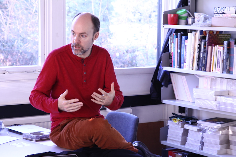
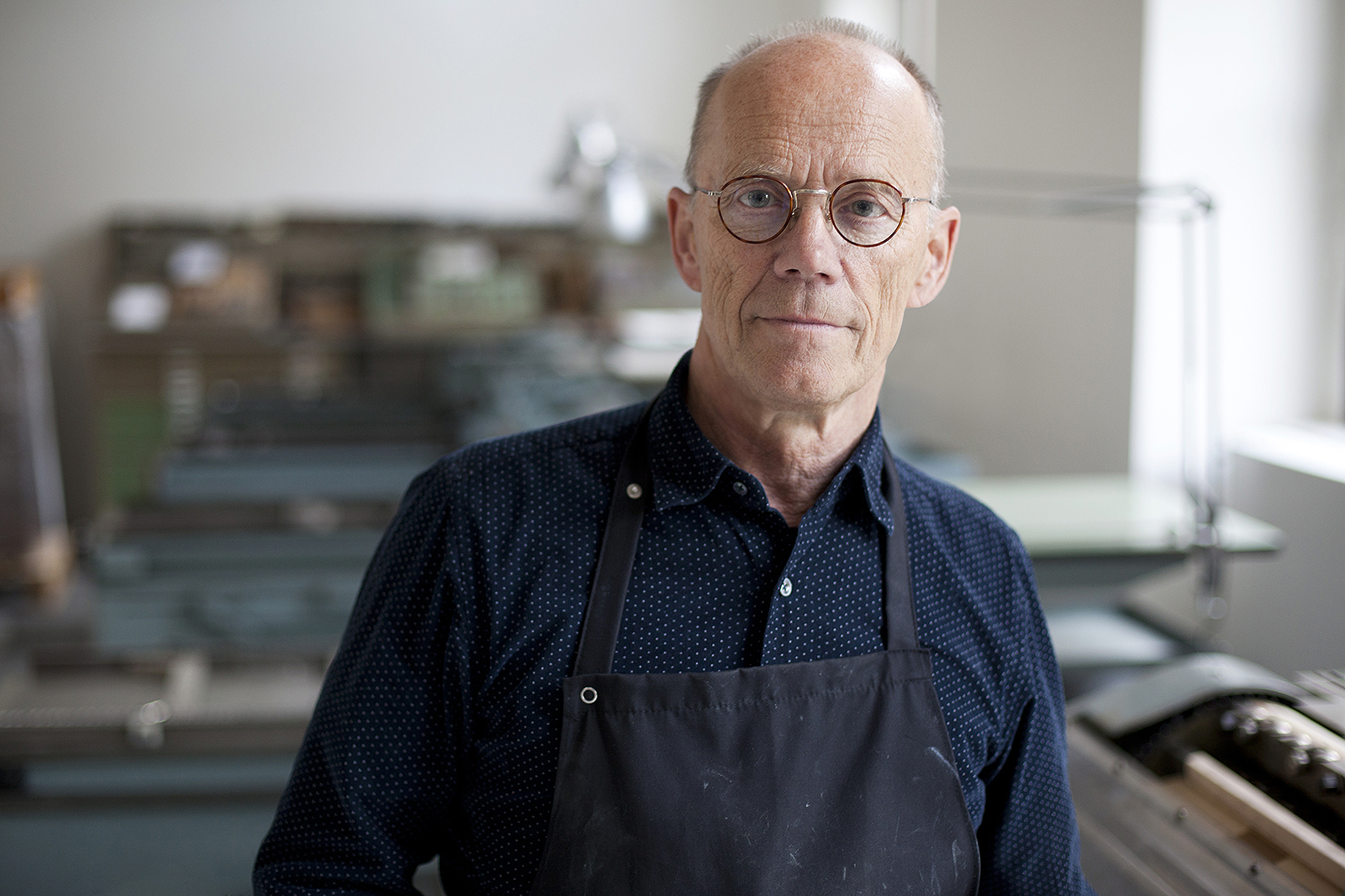
John Hudson of Tiro Typeworks. Photo by Ben Mitchell.
When did you first become aware that Adobe had an original typeface design program?
“Very early in my days doing desktop publishing [in the 1990s]. As I recall, the very first font license I purchased was for Adobe Garamond: the fonts arrived in the mail, on 3.5-inch floppy disks. I quickly built a collection of Adobe Originals specimen books, which were always interesting and attractive.”
How did you get involved as one of the external designers for the Adobe Originals program?
“We were commissioned by Adobe in 2001 to design new typefaces for Arabic, Hebrew, and Thai. These were initially for use with Acrobat interactive forms, so were designed with modern business communications in mind and generously proportioned to be legible on screen. I was responsible for what came to be called Adobe Hebrew, and worked with Tim Holloway and Fiona Ross to make the Adobe Arabic and Adobe Thai types. Other than their experience with CJK fonts, I think this was Adobe’s first direct foray into non-Latin font development. At the time, Adobe’s own OpenType Layout tools couldn’t handle the mark positioning we needed to do for these scripts, so we developed our own workflows. Of these three initial projects, the Adobe Arabic has been particularly influential: it ushered in a whole new style in Arabic type design, which I now see reflected in a lot of other new fonts.
“After the success of those first three projects, Adobe also commissioned a Devanagari typeface design, which was again produced collaboratively with Tim Holloway and Fiona Ross. It remains one of the most attractive Devanagari types available.”
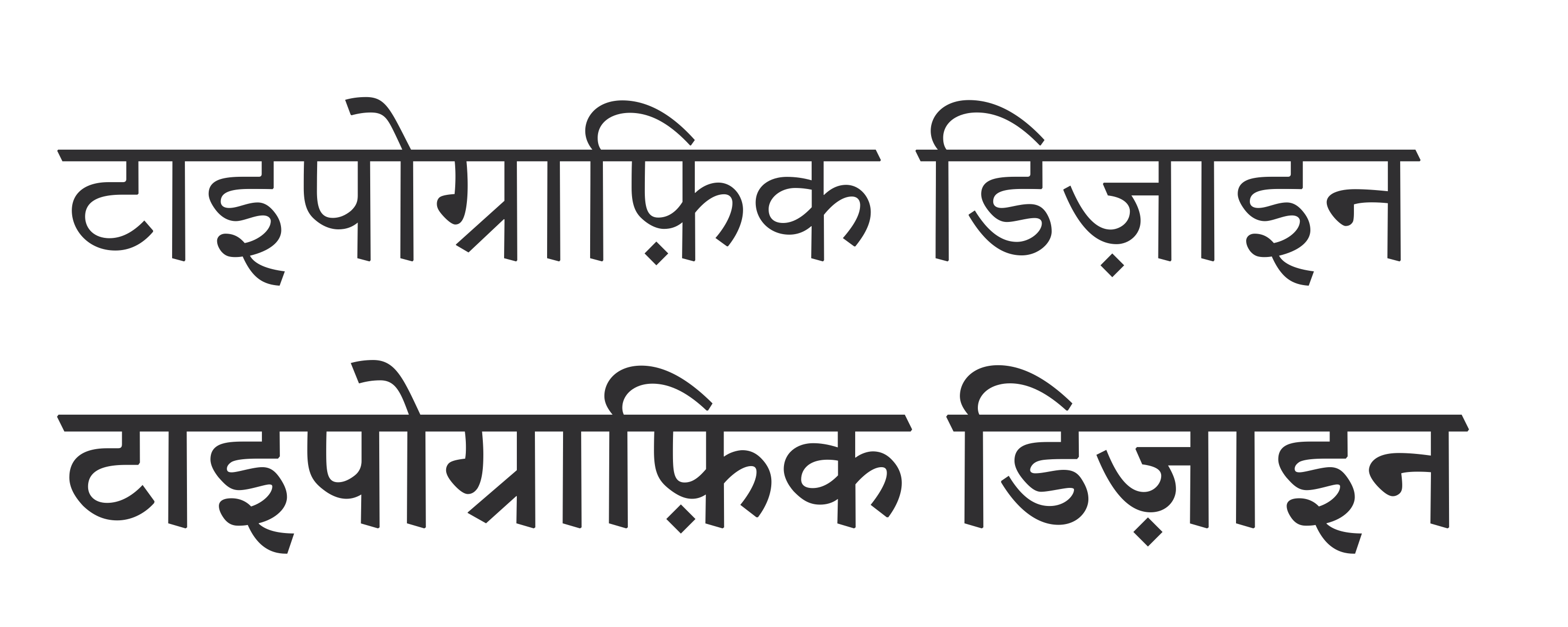
“Typographic Design” spelled out in Adobe Devanagari.
Who have you worked with mostly during your projects with Adobe?
“Tom Phinney organized the initial commissions, and then we worked with Christopher Slye to ensure we had the materials we needed for the projects. These included sets of Minion multiple master sources that we used to create custom weight and size instances of a Latin character subset to harmonize with each of the non-Latin scripts.
“Particularly interesting for me was working with Ernie March and Eric Muller to refine our workflow to solve QA issues. Because no one had ever tried to make CFF fonts in this way before, we found we needed to post-process some of the font tables in order to make them conform to Adobe’s standards. This meant decompiling those tables to XML and then manually editing them.”
Example of Adobe Arabic, which won a 2006 Type Directors Club award.
What is your favorite typeface design from the Adobe Originals collection?
“I am a huge fan of what I think of as the core of the Kepler design. There are all sorts of weight and width variants in that huge family that I’ve never seen any use for, but at its core is this incredibly good Romantic typeface that I’ve gone back to again and again. It has that ‘workhorse’ quality of so many of Robert Slimbach’s types, while also being very elegant and more readable than types of that style are reputed to be. A few years ago, I recommended it to a friend who was starting a new Canadian historical and political journal, and it works so well.
How do you feel the Adobe Originals program has contributed to type and design?
“Firstly, by setting the bar high and by showing what was possible in making new types for the new digital medium, instead of just converting older fonts from other technologies. Today, when we have so many new fonts being released every week, it is probably difficult for many people to appreciate just how typographically impoverished the early years of desktop publishing were in comparison. We were desperate for fonts, and what we mostly got were hastily converted versions of old standards and poor quality knock-offs of the same. The Adobe Originals program, along with pioneering work from a few independent foundries, changed that: new type designs for a new medium.”
What do you see for the future of the program?
“To be honest, I’m concerned about the recent focus on open source font development in the program. It seems to me a significant shift in the character of the Adobe Originals project, from a curated library of fonts for a professional design market to something that is more responsive to the demands (and funding) from large internet companies such as Google. While I admire Source Serif and the new Source Han Sans very much, and appreciate that the latter would have been unlikely to have been produced any other way, these fonts seem to me to sit uncomfortably beside the older Adobe Originals.”
Fiona Ross, PhD
Typographic Consultant in Non-Latin Scripts and Associate Professor in Non-Latin Type Design, University of Reading
Associate Designer, Tiro Typeworks Ltd.
reading.ac.uk/typography/
Adobe Originals Typefaces: Adobe Arabic, Adobe Devanagari, and Adobe Thai
How did you become interested in type and design?
“I came from a very different background from most of the people that I teach or collaborate with. I started in languages, and it was really because I did my second degree in Sanskrit with Pali. During the course of that, I read a lot of literature, and really, it’s from a love of literature that my interest in type design arose. Then my husband saw an advert from Linotype: ‘Can you prune the tree without damaging the roots?’ It was a language tree. I said, well, this is wrong. I was doing my Sanskrit finals at the time, having had experience of other scripts during my year at the University of Tuebingen, where I worked on transliterating book titles from India into the Latin script.
Fiona Ross at the University of Reading. Photo by Eben Sorkin.
“I was quite familiar with a lot of typefaces in Devanagari script from reading and looking at book covers. I was well aware of what was going on in the publishing industry before joining Linotype. I was young and had this sort of rashness of youth and noticing how terrible a lot of the publications were; the scripts were so beautiful, and the publications were so poor and how much could be done to remedy the situation.
“Many publications were in Linotype hot metal, which couldn’t kern or position accents properly. I was not the only person who felt these were quite poor publications — even foundry type was fairly limited at that time. I felt glad to be involved with the publishing industry. And my university tutors were very pleased. They felt they had someone of their own in the industry to help improve Indian-script publications.
“So I come from very much a research background, and that’s fed into everything I do, including my work teaching. I work very much collaboratively — I’m not a solo artist. I work with Tim Holloway. He’s a brilliant designer.”
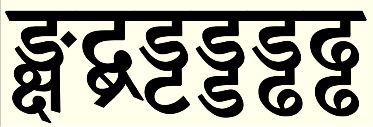
Example of deep and complex characters in Adobe Devanagari Bold, emphasizing roundness rather than verticality.
How did you get involved as one of the external designers for the Adobe Originals program?
“Linotype had a deal with Adobe — Mike Fellows was really instrumental in us working with Adobe. That was before we did any designs for the Adobe Originals. Before working with Adobe, we were creating and producing original designs for Linotype, which we would then convert to new formats, often with enhancements that exploited the new technologies. Full-page layouts rather than galleys and that kind of thing. That was 1988, I think, when we started doing this kind of work.
“These were the projects that dominated the late eighties — converting all our non-Latin library to Postscript. Later on, Tim Holloway and I were approached by Adobe, together with John Hudson (who we’d worked with on one Linotype project), to see if we could create original designs for Arabic, Thai, and Hebrew. Tim and I were happy to pick up on the Arabic and Thai. The Thai was wanted first, in a very short amount of time. I explained to Tim what I had in mind. He said, ‘Oh yes, I think that can work,’ and sent me seven sketches. I suggested changes, and we revised these and I took it on from that. Tim needed to work on Adobe Arabic; John was working on the Hebrew. I work in Gloucestershire, Tim in London, John in Canada, but I see John more often than Tim.
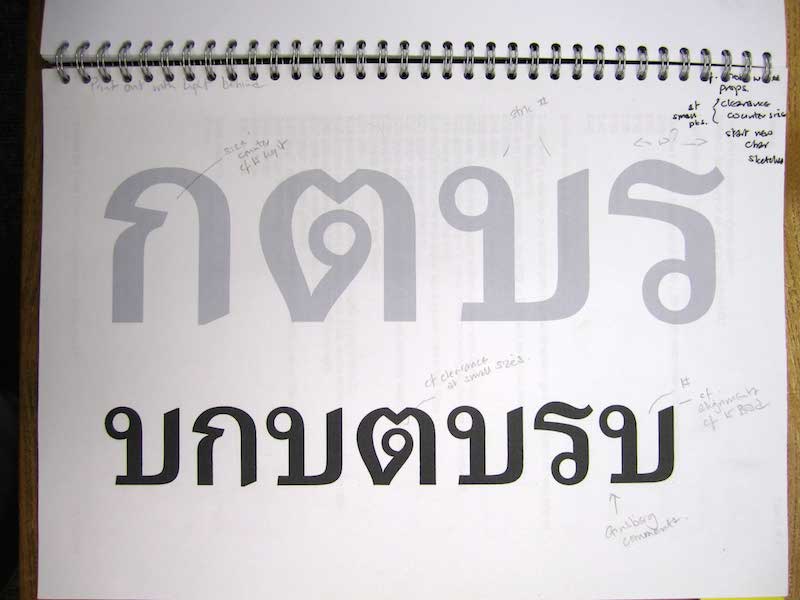
Adobe Thai trials with notes by Fiona Ross.
“Thomas Phinney was the one who brought the project to us, and it was excellent working with him. Really good. And, of course, David Lemon was involved, but Thomas was our main point of contact at the time. So that was really how it worked. I think ever since then, most of the work that I have done has been with John. I also work as a consultant on the current Adobe programs for non-Latin that involve Indian scripts, the ones Paul Hunt is overseeing. We did Adobe Devanagari, which I think is one of the best things we’ve done, fairly recently; Tim and me doing design, John doing the production, including the italics and rescaling the Latin companion. It had a lot of quite revolutionary aspects to it, in addition to the styling.”
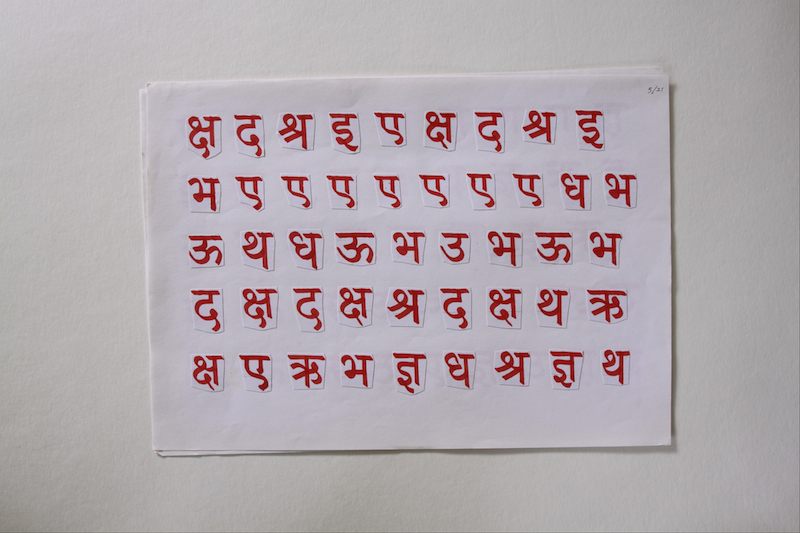
Adobe Devanagari lettering trials.
What is your favorite typeface design from the Adobe Originals collection?
“I would have to say Adobe Arabic is superb, and it’s very influential. It was novel in that the counters were open; the curves are very graceful; it’s very legible at small sizes. You can see Tim Holloway’s hand. He’s just so skillful at capturing the shapes of Arabic and bringing something new. I think that was groundbreaking.
“The second would be the Adobe Bengali. Linotype Bengali — the type Tim and I did 30 years ago — still dominates. I think this Adobe Bengali is going to add a new voice, which is very much needed.”
How do you feel the Adobe Originals program has contributed to type and design?
“Having good designs like these, and really, the fact that they function so well and have OpenType features and are Unicode-enabled. It has a huge impact in giving voice to the vernacular scripts. It’s hard to overestimate the importance that something like that has in adding to the sort of typographic palette that will be valuable in full Bengali typesetting. It’s not a minority script; it’s 300 million speakers. They’re still transliterating into Latin for text messaging. Four of the major daily newspapers all use Linotype Bengali, and only one has it legitimately. That’s the world we’re working in. I think what Adobe is developing is really important, and what they’re doing with enabling better foundations for Indian scripts in InDesign.
“The quality of the design work is very important: Combining design aesthetics and high quality of production with the technological attributes of OpenType. It’s the attention to details that shows in Adobe’s vernacular fonts and makes Adobe’s work stand out.”
Corey Holms
Graphic Designer
coreyholms.com
Follow @CoreyHolms on Twitter | on Behance
How did you become interested in type and design?
“I was really into comic books, which was this interesting weird medium that wasn’t text like a book or image like a movie, but was something wholly different. There were some experimental comics that did really interesting things like painting over photographs, gluing pieces of typewritten paper onto it and collaging disparate art forms together to tell a surreal story. I couldn’t explain why, but it was exceptionally compelling art to me. When I applied to art school, I explained that I wanted to be a fine artist that dealt in typography. Because typography was part of the design program, they had me meet with the dean of the design department, who in no short order convinced me that fine art was for hippies and that design was the way to go. To this day, I revel in the parameters set up by design projects and stumbled through typography into the world of design. I was very fortunate that the school I went to, CalArts (California Institute of the Arts) has a very strong typography program.”
Corey Holms in throwback mode.
How have type and typography most impacted your life?
“Designers are basically translators, helping people get ideas and concepts across to others. Typography is basically a signifier of language, and each typographic decision has meaning. I enjoy using type to add and clarify meaning in my projects. My primary design focus is in entertainment design, and the typography makes or breaks a poster. If I’m working on a science fiction movie, I use a clean, thin, condensed sans serif; it looks appropriate, it looks like the future. Take that same typeface and lower the crossbar, and suddenly you’re on the Orient Express, and you’ve ruined the poster. Typography tells you all those extra cues about authenticity that the reader may not even notice straight away. Typographic choices are a huge part of my job.”
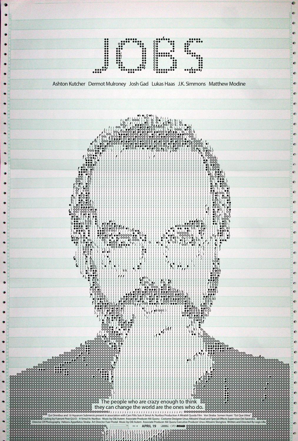
Holms’ film poster for “Jobs” features Myriad, an Adobe Original used as Apple’s corporate typeface.
When did you first become aware that Adobe had an original typeface design program?
When I was at CalArts, everyone was into experimental typography — David Carson, Emigre, Tomato, etc. — so I was kind of reactionary and would focus on classic typography. The Adobe Originals was where I looked to for those typefaces. It was my entré into non-postmodern typography.”
Have you ever had the opportunity to use typefaces from the Adobe Originals collection?
As a movie poster designer, we can all get a big laugh about the use of Trajan. But before it became a cliché, it was perfect for making something look elegant. For the appropriate project, I still use it today.”
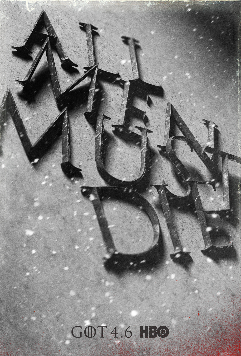
Holms’ used dimensional Trajan for HBO’d “Game of Thrones” promo.
What is your favorite typeface design from the Adobe Originals collection?
Waters Titling MM is my absolute favorite, because it is beautiful, elegant, expressive, and (most importantly at the time) made me look like a star. Also Penumbra.”
Why are these your favorites?
Waters Titling was a multiple master font (don’t get me started on the level of disappointment and rage I have to this day about the discontinuation of that technology), which meant that I could very easily customize the type to fit my needs and it would look phenomenal. I could fit it into tight spaces and customize it without losing the width of the stems, without any visible distortions. Whereas Trajan clearly looks produced, Waters Titling MM always had that human touch, made by a brush. It changed the feel of a poster from just epic to epic about a person. It was awesome.”
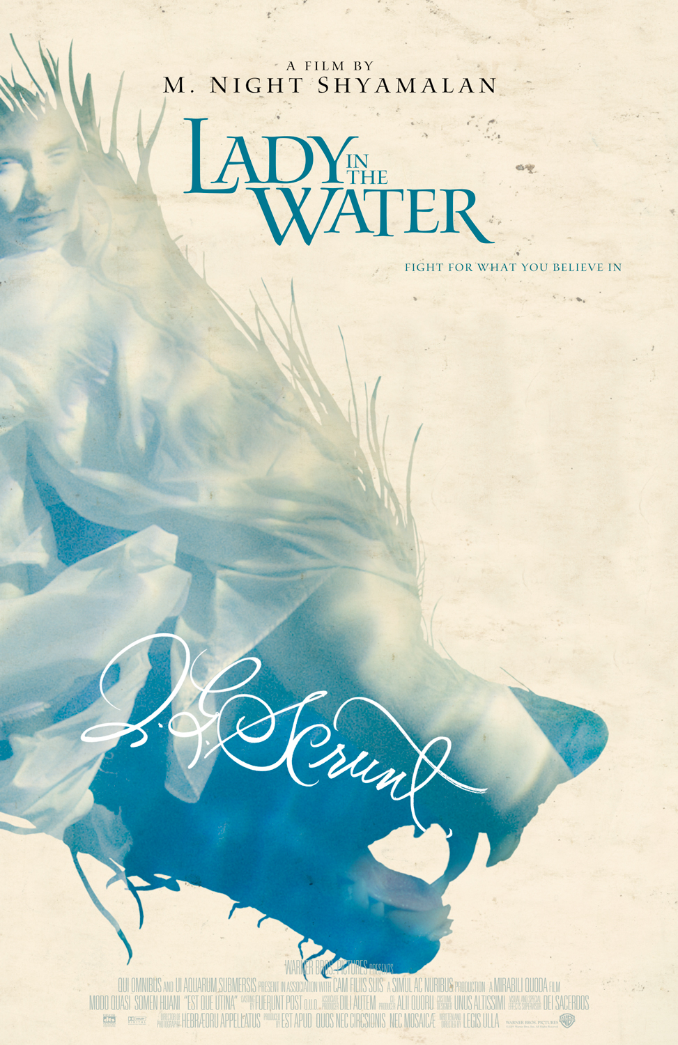
Holms’ spookily elegant poster for “Lady in the Water” features Waters Titling, a 1997 Adobe Originals release by Julian Waters.
Indra Kupferschmid
Typographer, Professor of Typography
University of the Arts Saar
Follow @kupfers on Twitter
How did you become interested in type and design?
“I became interested in what we call Schrift in German and Schriften (typefaces) in high school thanks to my art teacher who brought in Letraset catalogs and explained type classification to us (although absolutely nobody was interested in that but me). I didn’t even major in art but in chemistry, which I was thinking of pursuing after school. But the German type terms like Serifenbetonte Linear-Antiqua mit klassizistischen Charakter sounded so cool and it seemed all so crystal clear and logical to me that I thought, oh, this is just like science, I can do that. This bug never let go since. However, that all was before I even knew the term typography or what that was. That came a bit later, after I started studying at the Bauhaus University in Weimar. In my first or second week there, I saw a door sign that said ‘Professor of Typography’ and thought, this is what I want to do, without actually knowing what it was or implied (and that I might ever become a teacher myself).”
Typographer and educator Indra Kupferschmid in Bonn, Germany.
How have type and typography most impacted your life?
“Maybe the sport of identifying typefaces is where it all began to really have an effect on life. Once you start that, and become even kind of good at it, you can’t go through the world like a normal person anymore. The differences in typefaces got me interested in their history, terminology, the technique and people behind them, their design and production, and, of course, their use, but I’m almost ashamed to admit that the Type an sich part always interested me more.
“An even bigger impact on my life was serendipitously meeting like-minded people over the years. Fred Smeijers, who was my mentor and teacher for many years, and from whom I learned most of what I know about typefaces. Fantastic peers young and old I met on my restless expeditions into type and who I developed close friendships with, in particular Nick Sherman, my type alter ego; goading each other into concocting, considering, and collecting the craziest stuff. Type-related activities have a huge impact and huge place in my life today, for many years actually.”
When did you first become aware that Adobe had an original typeface design program?
“I first got exposed to some of Adobe’s typefaces in the mid-1990s, don’t remember exactly, but I had these 1990s specimen booklets for Caslon and Minion and the like. I didn’t know that this was a ‘typeface design program’ or anything, though, or how Adobe, the company, sit together. Also not sure how I even got those specimen books, probably at a conference? (My first was 1996 TypoBerlin). The catalogs I had as a student were still the (pretty horrible!) purple Creative Alliance ones, I think. I bet I still have all that somewhere.”
Have you ever had the opportunity to use typefaces from the Adobe Originals collection?
“Not that I remember, really, apart from Kepler when I worked as a freelance book designer for the German Bibliographic Institute that publishes the Duden (our ‘Oxford Dictionary’) and similar reference books in the early 2000s. The style guide specifies Kepler for text and listings (base design by Iris Farnschläder). It was a joy to work with Kepler!”
The “Duden,” Germany’s answer to the “Oxford Dictionary” uses Robert Slimbach’s Kepler for text and listings.
What is your favorite typeface design from the Adobe Originals collection?
“Because of the above-mentioned project, I really like Kepler. It is very flexible with its many styles/design axes, good atmosphere between the friendly and the authoritarian, good readability, versatile personality, and it’s not overused.”
How do you feel the Adobe Originals program has contributed to type and design?
“To me, the Adobe type department has most notably contributed with technological advancements and the popularization of multi-axis designs like with MM fonts. Some of the revivals in the type catalog are very worthwhile though.”
What do you see for the future of the program?
“Not so much innovation as I would wish for. It seems that it is a) about maintaining existing designs, expanding them, and bringing every possible font on the web, and b) the development of zero-priced fonts that are easy to implement into applications.
Fonts as add-ons to software more than typefaces as an independent form of design to advance the culture of type.”
Paul Shaw
Owner, Paul Shaw/Letter Design
paulshawletterdesign.com
Follow @PaulShawLetters on Twitter
How did you become interested in type and design?
“Through being interested in calligraphy and lettering. A natural extension of a general interest in letterforms and, specifically, of the work of W.A. Dwiggins, Rudolf Koch, Hermann Zapf, Georg Trump, and Karl-Erik Forsberg. An interest in design was an outgrowth of being interested in lettering and typography. It is hard to have graphic design without letterforms. So, I think I started with an interest in book jackets by calligraphers and letterers such as George Salter, Phil Grushkin, Michael Harvey, and Helmut Salden; record covers by Reid Miles (once I discovered jazz and Blue Note Records); then Art Nouveau posters (especially by Mucha, Koloman Moser and Alfred Roller) and Art Deco posters (Cassandre); and, after that, the work of Herb Lubalin and Lou Dorfsman. And on and on.”
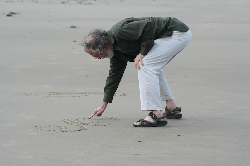
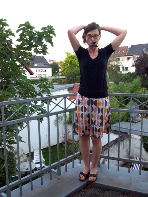
Paul Shaw draws letters on a sandy Oregon beach in 2011. Photo by Bronwen Job.
How have type and typography most impacted your life?
“It changed my career plans from studying the history of American labor to studying Dwiggins and working as a lettering artist, which led to my present mixed career. It is all due to discovering William Morris and the Kelmscott Press.”
When did you first become aware that Adobe had an original typeface design program?
“When it began in 1989 with the release of Adobe Garamond and Lithos/Trajan/Charlemagne.”
Have you ever had the opportunity to use Adobe typefaces from the Originals collection?
“I have used many of them in teaching: Adobe Garamond (and the premier version), Trajan, Utopia, Adobe Jenson, Minion, the Wood Type series, Ex Ponto, Caflisch Script, Poetica, Adobe Caslon, Bickham Script, Chaparral, Silentium, Arno, and I am sure others. In work, I think I have used Mezz, Poetica, Blackoak, Poplar, and Bickham Script.”
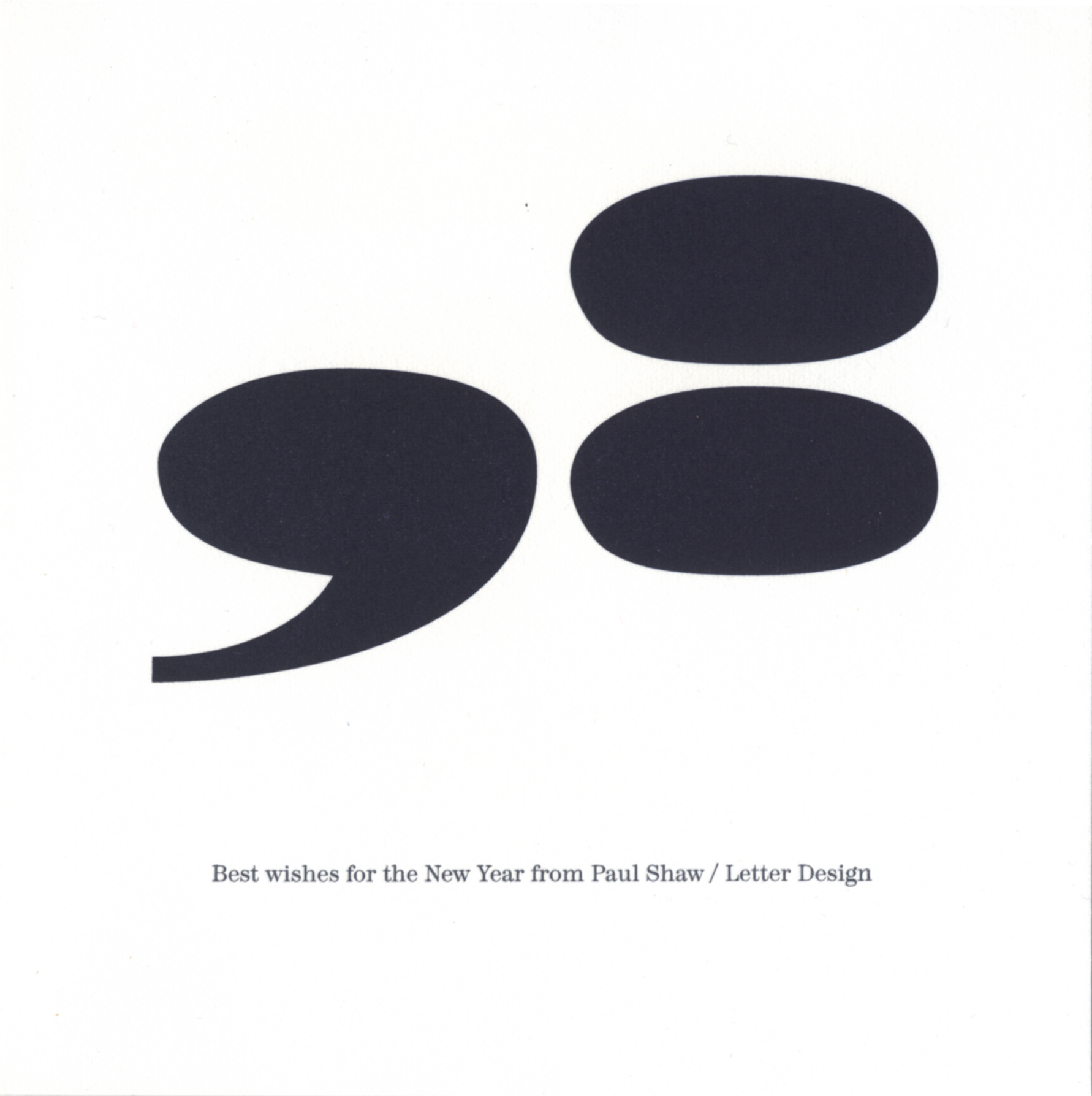
Super-sized punctuation from Madrone, one of the Adobe Wood Types, dominates Shaw’s 1998 New Year’s greeting.
What is your favorite typeface design from the Adobe Originals collection?
“Not sure. Possibly Poetica or Bickham Script. (Except that Poetica badly needs a display version.) But I really admire Utopia and Minion.”
Why are these your favorites?
“Poetica is an astonishing achievement. Hidden in its original twelve or so subfonts are all sorts of goodies (along with some swash letters that should have been left out), principally the set of ampersands and the roman caps. Both are excellent for use with other fonts. Poetica is significant because it is an italic that is not mated to a roman. There are only a handful of such faces and none with its versatility. I think I included it in my list of the ‘100 Most Significant Typefaces of All Time’.”
How do you feel the Adobe Originals program has contributed to type and design?
“I think the original program (from roughly 1989 to about 1992) was highly important in the history of typography and graphic design. Adobe Garamond and Trajan proved to skeptical designers (especially those in the world of book design) that digital type could be as good, if not better, than the metal type they were nostalgic for in the phototype era. Adobe Garamond was a true Garamond, arriving at a time when ITC Garamond was incredibly popular (even being the basis for the Apple logotype). It had true small capitals, old style figures, extended fractions, and other items that had disappeared from the phototype versions of many classic book faces. I think it was a pivotal design. Trajan is important because its design proved that the new digital tools could handle subtle letterforms and that digital type did not have to look ‘digital’ like Matrix or be stripped down like ITC Charter. They could replicate any letterform from the past that one wanted. Trajan also made the iconic letters of the Trajan inscription familiar to a wider world of graphic designers.”
What do you see for the future of the program?
“I don’t really know. The last Adobe Original I paid a lot of attention to was Garamond Premier Pro. The only other font in the program that has caught my eye since 2006 has been Trajan Sans. It seems the program is shifting toward non-Latin fonts and web fonts, two areas that I have little interest in at the moment.”
John D. Berry
Director, Scripta Typographic Institute
typoinstitute.org | www.johndberry.com
How did you become interested in type and design?
“I have no idea. I didn’t study type or design; in fact, when I was a student, I was barely aware that such things existed, and had no clue that eventually typography would become my métier. Though perhaps it’s significant that during a ninth-grade class trip to Colonial Williamsburg, the colonial business that I chose to focus on was the printshop.
“I have always been interested in both words and their visual presentation, which seem to me to go hand in hand. That’s why I usually describe myself simply as a typographer and editor: it’s all about the arrangement of words.”
When did you first become aware that Adobe had an original typeface design program?
“When it began. Certainly I was well aware of it when I went to my first type conference, Type90, the 1990 ATypI conference in Oxford.”
Have you ever had the opportunity to use typefaces from the Adobe Originals collection?
“Many times. In 1990, for a new edition of William Everson’s long poem River-Root by the new publisher Broken Moon Press, I chose Carol Twombly’s newly released Lithos as the display face for the cover and a dramatic two-page title-page spread. I’m not sure, but this may have been the first use of Lithos in a book. Certainly, this was well before the typeface got picked up by MTV and found its way into almost everything; in 1990 it was new and fresh. Besides, the poem’s subtitle, A Syzygy, had three y’s; the plunging capital ‘Y’ of Lithos looked wonderful in it.”
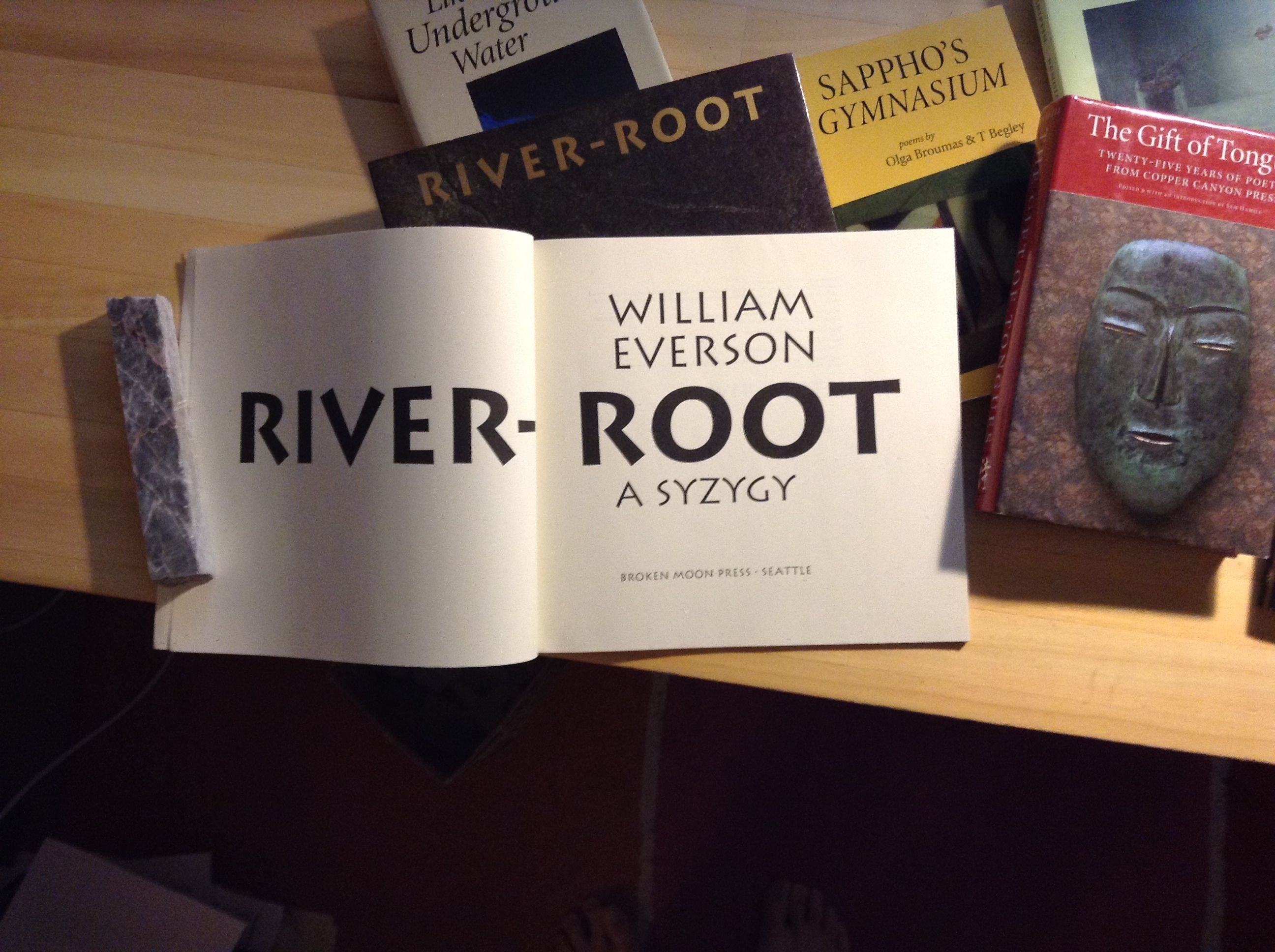
Carol Twombly’s Lithos is featured in this Broken Moon Press edition of William Everson’s “River-Root,” designed by John D. Berry.
“I used Minion quite a lot in the 1990s as a text face. It had (and has) much of the elegance of the hot-metal Bembo, but worked better in digital typesetting because it was designed from the start with that in mind. I also used Minion sometimes as a display face when I was using Bembo for the text of a book. (See the cover of Selected Poems of Su Tung-p’o.) This was in the days before direct-to-plate typesetting, when you could control the output of type onto RC (resin-coated) paper and use the density to beef up a thin digital adaptation like Bembo or Centaur.
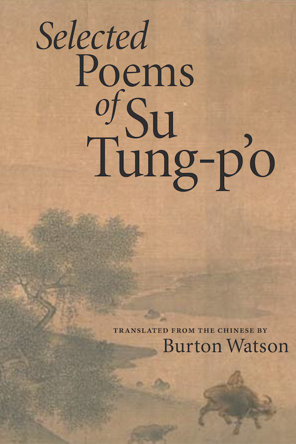
Berry used Robert Slimbach’s Minion in designing the cover of the “Selected Poems of Su Tung-p’o.”
“On a complex book for University of California Press, originally sketched out by Steve Renick and then given to me for completion as an outside designer, I used Adobe Garamond (which Steve had spec’d) for the text and Myriad (which he hadn’t) for captions and secondary material. It worked well, and I think achieved the kind of balanced, very typographic look that UC Press specialized in when he was art director. (I had to track a light weight of Myriad a little loose in order to make it comfortably readable; it’s always been slightly too tight by default.)
“When the University of Washington Press asked me to design a small book about Chief Seattle’s famous speech, Answering Chief Seattle, I found a chance to use Kepler and take advantage of the flexibility of its multiple-master origins.
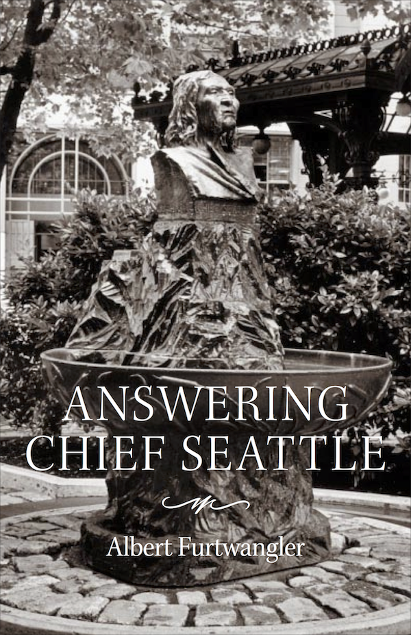
Berry employed Slimbach’s Kepler in designing “Answering Chief Seattle.”
“I even found a book use for the wonderful Caflisch Script, when I designed the cover for Anna Swir’s Talking to My Body, a translation by Czesław Miłosz and Leonard Nathan that was published by Copper Canyon Press. Caflisch Script’s almost monoline handwriting echoed the tied string in the photograph of a sculpture that we used as the dominant cover image.
“Much more recently, I finally got to use Warnock Pro, which is gorgeous, but a little too spiky and idiosyncratic for most of the books I design. This was for a very large illustrated book, Acutonics: From Galaxies to Cells, where I felt that the colorfulness of Warnock Pro would be attractive to the book’s potential audience, while still being extremely readable en masse. (Again, we used Myriad as a complementary sans.)
“When her friends published a Festschrift for Ursula K. Le Guin on the occasion of her 80th birthday, and asked me to design the book, I found that Adobe Jenson fit the project perfectly. Its classic associations worked well with Le Guin’s work and the varied material by the contributors to the book, and the way Robert Slimbach had designed his Jenson as a robust digital typeface meant that it carried through well as readable and adaptable text.
“This is by no means an exhaustive list, of course.”
What is your favorite typeface design from the Adobe Originals collection?
“I suppose the Originals typeface that I’ve put to use most frequently is Minion, notably in its multiple master version. The multiple master technology was never properly integrated into Adobe’s applications, but it was brilliant; it should have been built in so that everyday users got the benefit of MM’s capabilities by default (especially the optical-size axis, which I believe Minion was the first to exploit). I used Minion’s MM range quite a bit, crafting exactly the text version I needed as I designed books, notably for Copper Canyon Press, and used Minion in Copper Canyon’s visual identity for brochures, ads, and catalogs. I also used Minion in many CCP books, including their 25th-anniversary anthology, The Gift of Tongues.
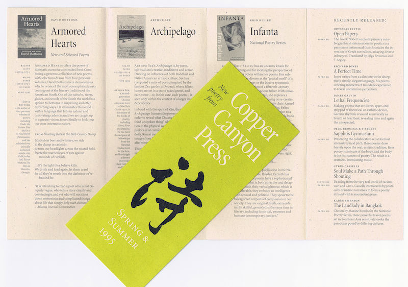
Berry uses Minion extensively in branding and promotional material for Copper Canyon Press.
What do you see for the future of the program?
“Continuing to give the typographic world new families of elegant, functional text typefaces, and occasional display faces, that will work with the evolving technology of publishing and reading.”
Marian Bantjes
Graphic Artist
bantjes.com
Follow @bantjes on Twitter
How did you become interested in type and design?
“I fell into a job at a book typesetter in the days of phototypesetting, where I was trained from the ground up in the fineries of book (and magazine) typesetting. It was a job that I became good at, then passionate about.”
How have type and typography most impacted your life?
“Well, I have observed with students that the learning of typography — the awareness to type that comes with it — changes the way you look at the world. The more you learn, the more you notice, because type is absolutely everywhere, and it affects how you see streets and everything you read. It can make or break any reading experience. So this happened to me, of course, but also, it somehow wormed its way deeper into the artistic part of my brain and eventually became a major component of my work, in fantastical custom lettering.”
When did you first become aware that Adobe had an original typeface design program?
“In the early 1990s, when I started a design firm. Adobe was *the* place to buy type from, and typefaces such as Adobe Garamond became the backbone to any collection.”
Have you ever had the opportunity to use typefaces from the Adobe Originals collection?
“It was the 1990s to the early 2000s, and by perusing the list, these are the ones I remember. This was pre-OpenType, so there were no Pro versions at the time. I ran a design studio, and we bought and used a lot of fonts for a lot of projects: “Arno, Bickham Script (which remains one of the most beautiful scripts ever designed), Birch, Blackoak, Caflisch, Carta (used extensively, both for its useful icons and ironically, for its tank and battleships), Caslon, Charlemagne, Cottonwood, Adobe Garamond, Giddyup (yes, I confess: the dingbats, I believe), Ironwood, Adobe Jenson, Lithos, Madrone, Mesquite, Minion, Myriad, Nueva, Penumbra (I had this in the multiple master version and it was an astonishingly beautiful and elegant typeface in all of its many variations), Pepperwood, Poetica (I was on the bandwagon of the Poetica craze!), Poplar, Rosewood, Tekton (I probably only used this once, as it quickly fell out of favor due to overuse, and was considered tacky: especially if used for architecture firms), Trajan, Utopia, Warnock, Willow, Wood Type Ornaments, Zebrawood (I’m surprised by the number of wood types I used, but when you need one, well, these are the ones you need).”
What is your favorite typeface design from the Adobe Originals collection?
“Either Penumbra or Bickham script.”
Why are these your favorites?
“Bickham Script is incredibly well crafted. It flows beautifully and was one of the first to have an extensive set of alternates and swashes. It was a revelation at the time that a font could be adapted in so many ways and could take on aspects of uniqueness depending on how one used it. But, more importantly, it holds up over time. If I could have only one script, it would be this one.
“Penumbra filled the gap of semi-sans where the much reviled Optima failed. Of course Penumbra was so much more, being variable between serif and sans. It’s incredible that it worked at all, visually, let alone how well it worked. Penumbra is in that corner marked ‘elegant,’ and yet it is more modern than most of its ‘elegant’ contemporaries.”
How do you feel the Adobe Originals program has contributed to type and design?
“Well, I’m not an expert on such things, but of course they were known for the creation of quality text faces as well as a few exceptional display faces in the 1990s. When the type world was going experimentally mad, the Adobe Originals was a sort of haven of sanity, with greatly esteemed type designers. I believe they invented the multiple master system which, sadly, ultimately failed, but was a great experiment in its time.”
What do you see for the future of the program?
“In all honesty, the program seems to be stagnant. I’ve not heard of anything significant coming out of Adobe for a very long time. There was a number of years I didn’t even know they still sold type! Almost all of the faces in the list are well known to me — from 20 years ago. Typography went through an explosion in the 1990s; Emigre ousted Adobe as *the* place to get type, and now a decent number of excellent independent firms can be counted on to deliver great typefaces, with Hoefler and Co. arguably *the* hot studio of the past six years or so. Monotype continues to absorb the rest of the old great foundries to gain a monopoly on the historical standards. Adobe, as far as I know, is nowhere to be seen. They would need a major investment of time, energy, cash, and some brilliant designers with new ideas to re-enter the scene at this stage.
“Well, you may not want to print that, but there it is!”
Alastair Johnston
Editor/Publisher, Poltroon Press
poltroonpress.com
How did you become interested in type and design?
“Through writing and drawing as a child. I always drew elaborate letterforms (like the MAD magazine logo and lettering from posters and dust jackets), drawing them in outline rather than calligraphically, and when I dropped out of college, I supported myself for a few years as a signwriter before becoming a letterpress printer.”
Alastair Johnston at Poltroon Press, which he co-founded with Frances Butler in Berkeley in 1975.
How have type and typography most impacted your life?
“I have spent a lot of time setting type by hand, or by computer, and printing. When you handset type, you are not only looking at the characters, but the spacing around and between them; and often you are making decisions about 1/144th of an inch in letterspacing, which is about as small a space as the eye can distinguish. I have also studied, written about, and taught the history of type and typography.
When did you first become aware that Adobe had an original typeface design program?
“Probably about 1984, when Sumner Stone gave an Apple Mac to Wesley Tanner, whom I knew. I had known Sumner as a calligrapher and also at Autologic, where they worked on a Janson revival. We discussed the Caslon type specimen of 1734.”
Have you ever had the opportunity to use Adobe typefaces from the Originals collection?
“Before the creation of Lithos, Adobe was considering a revival of Koch Neuland. I made repros of my eight sizes of Neuland types (the letterforms are different at each size) for Lynne Garell. Ginger contacted me when Adobe was considering wood type revivals, and I put her in touch with Rob Roy Kelly. Around 1999, David Lemon, who had been my student, hired me to work on an online database describing all the types in the Adobe and ITC collections. They were all generous in giving me review copies of types, but at the time I used Sabon for almost everything (now I use Swift a lot). However I always appreciated the booklets!
“I used some of the Adobe types in The Ampersand, a book arts magazine I edited for 15 years. I remember having problems using multiple masters. In the magazine, we regularly reported on the struggle between Adobe and Microsoft with articles titled Hot Air and Vaporware, and Font Wars. In 1990, I wrote an article in The Ampersand called Adobe Awakens, after the release of many new types, where I said, ‘Now that the slumbering giant has finally awoken, let’s see if Adobe can save the Princess Desktop from the poisoned Apple and a fate worse than ITC.’ In the article, I reviewed the three new faces of Carol Twombly, saying, ‘Lithos, instead of being an instant classic, is one of those easily recognizable novelties that is already wearing thin. Charlemagne seems tailor-made for Sonoma Valley vintners,’ and my pick-to-click ‘Trajan outdoes anything old Fred Goudy ever produced.’ I also wrote a lengthy analysis of Minion and dismissed Tekton as rubbish.”
What is your favorite typeface design from the Adobe Originals collection?
“I like the Wood Types. They fill a gap in the library. I am a fan of the decorative late nineteenth-century American types. I would like to see more well-done revivals of late nineteenth-century display faces (but not text faces), just for fun.”
How do you feel the Adobe Originals program has contributed to type and design?
“There was a type conference at Stanford in the early 1980s (I think Donald Knuth was behind it: he was an enthusiast with no aesthetic sense) and Hermann Zapf said something really profound. He said, ‘we need new types for new technology.’ I agreed, and felt it was a mistake to try to revive Garamond, Caslon, and Jenson, which were designed in and for completely different media. I always felt it was a mistake of Adobe to pursue these ideas. I am glad they are now focused more on original work.”
What do you see for the future of the program?
“The program was important in supporting and recognizing the work of type designers and giving them not only credit, but income. However, historical revivals are no longer useful for text, and certainly not on computers, which are increasingly our reading environment. So to reiterate Zapf: new types for new technology.”
Do you have examples of Adobe Originals in use that you feel are significant or special that you are able to share?
“I made a collection of examples of Lithos when it first came out to show (my students) its use and abuse in popular print and signage. Sumner Stone told me they feared designers were stretching and condensing types beyond reason, so Adobe wanted built-in resistance to anticipate this, which is why they went with the taffy-like qualities of Lithos as opposed to the more rigid Neuland, and why Lithos (which, in some ways, is a revival of Pericles) did so well. There was a plague of Rosewood Fill in the early 1990s, showing that designers still wanted to play with and modify types and refused to use them out of the box.”
Erik Spiekermann
Founder and Partner, FontShop International and Edenspiekermann
spiekermann.com/en
Follow @spiekermann on Twitter
How did you become interested in type and design?
“I got a little printing press when I was twelve. That’s when the bug bit.”
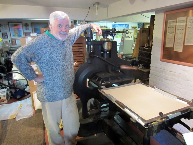
Erik Spiekermann in the printshop. Photo by Max Zerrahn.
How have type and typography most impacted your life?
“The fact that type is visible language and that, without it, there would be no culture, no science, no communication.”
When did you first become aware that Adobe had an original typeface design program?
“At or around Type’87, the ATypI conference in NYC, where I met several Adobe designers, as well as Liz Bond and Sumner Stone. They then invited me to be a guest on the Type Board.”
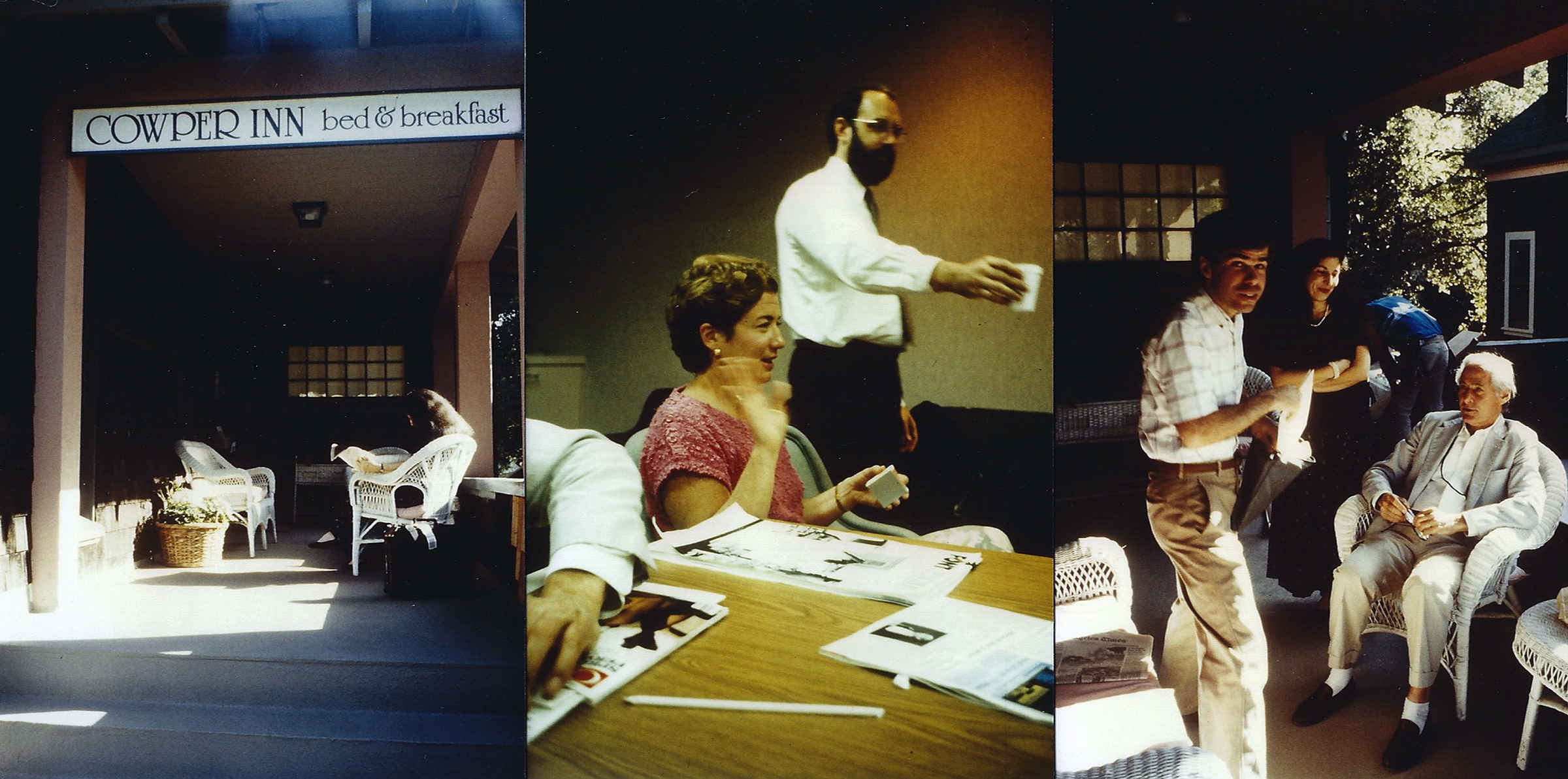
According to Spiekermann: “These three pictures are a scan of very bad and very small color prints from photos I took back in 1988 or 1989.” Far left: The Type Board meeting place at the Cowper Inn in Palo Alto; center: Liz Bond and Sumner Stone; far right, pictured from left: Type Board members Stephen Harvard, Louise Fili, and Jack Stauffacher.
Do you have any stories to share from your experience working with Adobe?
“In 1988, I also got invited to participate in the Adobe Publishing Packs. I worked on that with Gail Blumberg from Adobe who brought in Bill Hill, then with Ideo, to work with us on the concept. Bill and I first met in Palo Alto for that project and, not much later, decided to start the SF branch of my then-design firm, MetaDesign. The office opened in June 1992, and one of our first projects was the production of Stop Stealing Sheep for Adobe Press, which I wrote with the help of E M Ginger as editor and chief butt-kicker. The text was set in Minion, the cover in Myriad.”

Adobe Publishing Pack curated by Spiekermann, circa 1988.
Have you ever had the opportunity to use typefaces from the Adobe Originals collection?
“For a while, Minion and Myriad were our staple corporate faces. We often used the multiple master technology to generate specific weights that we would then rename for the client. One of the biggest projects was for Springer Publishing, one of the biggest scientific publishers in the world. To this day, they use SpringerMi [customized Minion] for text and SpringerMy [customized Myriad] for headlines. I introduced Utopia as the serif companion for Futura (which we had redesigned for the purpose), the typeface used for Volkswagen’s branding from 1994. Also still in use today. I also mixed Minion with my own FF Meta a lot, for example for the WDR, Germany’s largest TV and radio station. When we finally designed FF MetaSerif as the companion face, Minion was the benchmark.”
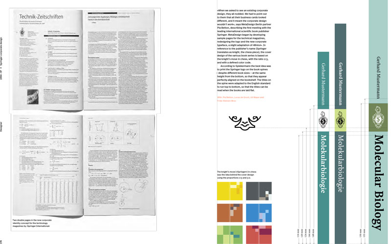
Spread from a forthcoming book about Spiekermann (Gestalten Verlag: “Hello, I’m Erik”) shows the Springer publishing project using Myriad and Minion.
What is your favorite typeface design from the Adobe Originals collection?
“Definitely Minion. It is incredibly versatile, but not at the expense of originality. It feels different without it being in-your-face over-designed. A great combination of all the qualities of classic serif faces with the choices offered by a large family of weights and widths, and one of the best italics ever. It makes Times New Roman look meek and totally useless by comparison.”
What do you see for the future of the program?
“There are still areas of typographic problem solving not addressed by an Adobe Original. And there will always be a new technology for making and using type and fonts. Adobe invented tools and methods that have become standard, and I expect that to happen in the future as well. A commitment to type not only supports the other applications, but is expected from designers everywhere.”
Up next: The final chapter — a “where-are-they-now” glimpse at the Adobe Originals team, past and present.
Keep up with the Adobe Originals celebration via RSS by bookmarking this series. And, in case you missed any posts, check out the rest of the series!
Updated December 8, 2014: At the request of some interviewees, quotations in this article were modified to more accurately reflect their opinions.
One Response
Comments are closed.
What a fascinating history of Adobe and these type pioneers.