Charming mischief: Introducing Ten Mincho from Adobe Originals
Ten Mincho is the latest Japanese typeface design from Adobe Originals, designed by Ryoko Nishizuka, Chief Type Designer at Adobe. We’ve added it to the Typekit library for web and sync, which is included with paid Creative Cloud plans for no additional cost.
Prominent in the design are the dynamic characteristics of hand-written characters, as well as a stroke formation style that is typically seen in the Kawaraban printed newspapers from the mid- to late Edo period (1603–1863) in Japan. As a traditional Mincho-style design the strokes are slightly heavy and rounded, and exhibit smaller counter spaces. Ten Mincho will be useful for a broad range of settings, such as advertising copy, book titles, and headings.
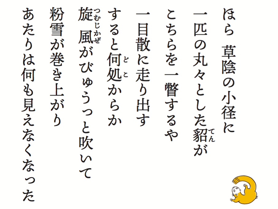
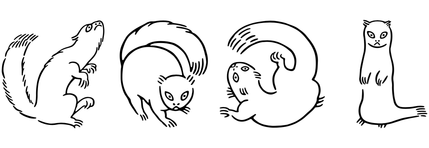
For a little surprise tucked away in the glyphs, a marten (“Ten” in Japanese) is right at home. Twelfth-century ink illustrations such as Choju-giga (鳥獣戯画) were the inspiration here, and it’s a charming addition to the design.
“Generally typefaces in the Mincho style are classified into traditional and modern styles,” explains Nishizuka, “but I had been wondering if this multi-purpose typeface couldn’t take a different direction — something traditional yet spirited, inspired by some hand-written kana characters I happened upon.”
Ten Mincho also features a full set of Latin glyphs, collectively known as Ten Oldstyle and designed by Robert Slimbach, Adobe Type’s Principal Designer. Ten Oldstyle combines the immediacy of calligraphic writing with the practicality of classical humanist book types of the Italian Renaissance.

This fully-functional and relatively feature-rich Latin subset includes OpenType features that are generally not found in Japanese fonts, which provide support for small caps, tabular figures, old-style figures, and more — along with a separate italic face.
Design collaboration
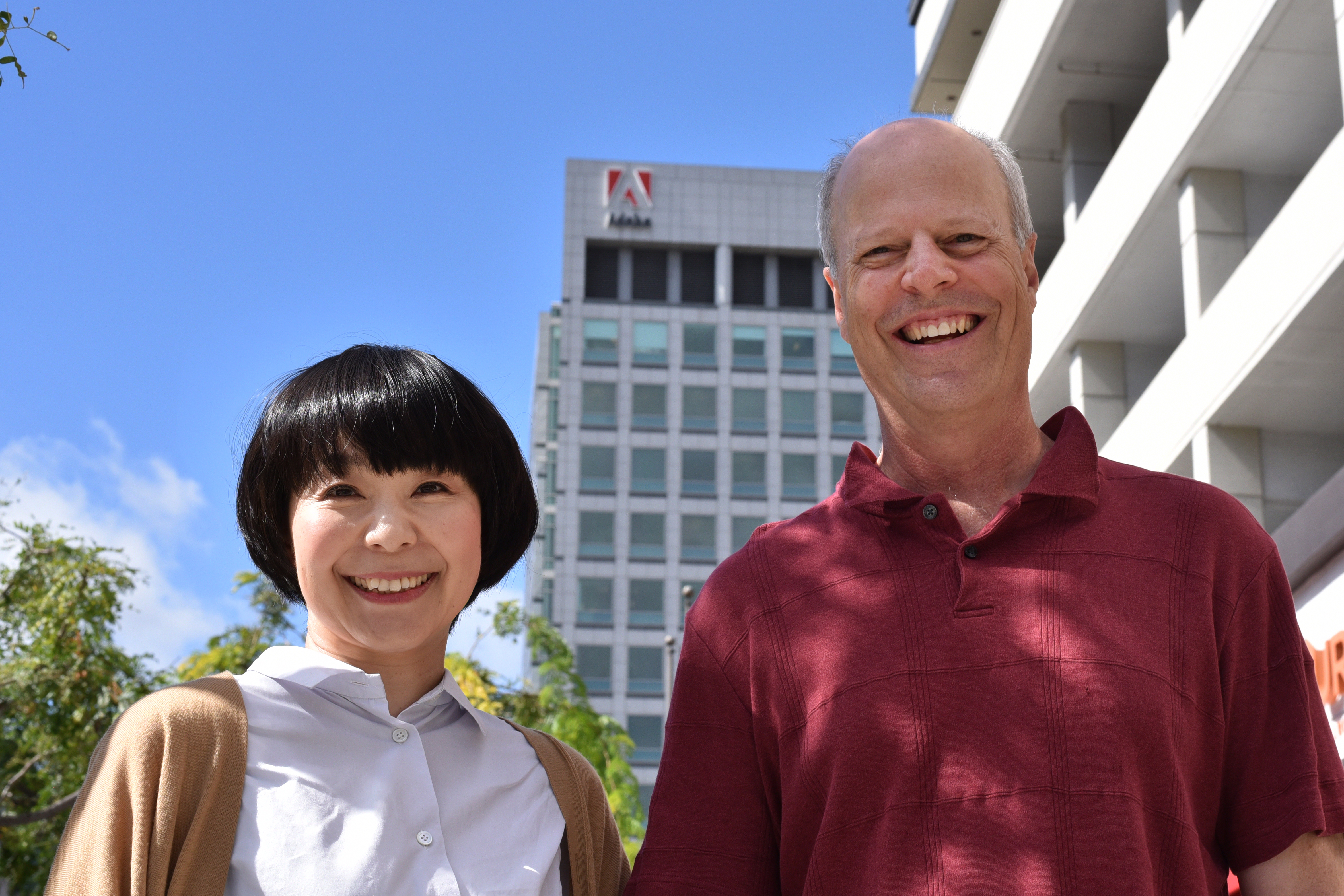
Ryoko Nishizuka and Robert Slimbach at the Adobe San Jose office.
In order to make Ten Mincho a harmonious typographic system, Nishizuka and Slimbach compared notes all the way through the design process.
“It was more difficult than I had expected to design Ten Mincho to suit both display and body text without significantly distorting the traditional form, and it took a while to settle on a design,” says Nishizuka. “Creating a new variant on Mincho style required a lot of research and several rounds of modification, and it wasn’t easy to give kanji the same dynamic expression as the kana characters.”
She persevered with her work on Ten Mincho, and around the time she’d begin to settle on her design direction, she saw some work in progress on a serif typeface from Slimbach and admired the calligraphic touch. “I thought its style might harmonize well with Ten Mincho, so I reached out to him hoping that he’d be interested in consciously developing the serif design to pair naturally with it.”
Slimbach notes that from the outset, the nature of this project presented an interesting challenge. “Japanese and Latin fonts don’t naturally relate in terms of their structure, alignments, and proportions, so it was a special challenge to devise a Latin counterpart that is compatible with Ten Mincho in terms of both function and general appearance.”
Nishizuka was impressed by Slimbach’s work from the beginning of their collaboration. “I felt strongly that we would make the collaboration successful with a shared intention for the two designs, even if particular character elements and shapes are different between Japanese and Western type,” she says.
Some common attributes of book typography presented a useful starting point for the designers. Slimbach observes, “The presence of the human hand is clearly present throughout the Ten Mincho family. The handwritten basis of both Japanese and Latin book types—while dissimilar in practice—provided a means for creating a visual link between the Western and Japanese scripts.”
Nishizuka speaks to a similar philosophy regarding her own approach. “When harmonizing Japanese and Western type designs,” she says, “it’s important to decide which design properties should be aligned. I prefer not to force conformity upon every detail. Instead I believe harmony comes when the designs are historically consistent, and the weights and counter spaces are well-balanced on the whole.”
Meeting face-to-face gave the designers the opportunity to walk through sketches together and get a better understanding of how the shared vision for the typeface would come together — and how to translate the spirit of Ten Mincho into Slimbach’s Latin glyphs.
Collaboration resulted in changes to both Latin and Japanese elements of Ten Mincho. Slimbach made the serifs thicker to attain better balance; meanwhile Nishizuka adjusted several of the Japanese glyphs to better harmonize without losing their dynamic spirit. She remarks, “I think there’s a certain impish personality fused into the traditional Mincho style, and the shapes of Ten Mincho reflect this. I really believe the final design is the unique result of our collaborative work, and would not have turned out the same way if we’d done the designs separately.”
Coming soon: Color SVG & OTC deployment
We’ve released Ten Mincho with black and white versions of several fun glyphs, and our next release in 2018 will introduce color SVG versions of these designs.
At that point we’ll also make Ten Mincho available as an OpenType Collection (OTC). In contrast to our previous open source OTC deployments, such as the Source Han (Pan-CJK) families, Ten Mincho OTC will be exclusively a commercial offering.
For the time being, Ten Mincho is available on Typekit for web and sync. For more information on the technical development of Ten Mincho, look no further than the CJK Type Blog.
Enjoy Ten Mincho, and let us know what you think! Adobe Type is on Twitter, and we’re always happy to answer questions at support@typekit.com.