The Adobe Originals Silver Anniversary Story: Typographic Tales from Japan
This is the sixth in a series of articles from Tamye Riggs, a longtime lover of type who is working with us to celebrate the twenty-fifth anniversary of the Adobe Originals type design program. This post explores Adobe’s entry into the Japanese type market and how the Originals program continues to thrive in Asia.
Apple and IBM had their devices manufactured in Japan. We knew that either we signed them up with PostScript or they’d come up with a solution themselves.
— Charles “Chuck” Geschke, Adobe Co-Founder (As quoted in “Inside the Publishing Revolution,” Pamela Pfiffner, Adobe Press, Berkeley, 2003.)
Almost 26 years ago, we started a relationship with Morisawa (which, at the time, was kind of the number two company in Japan). But we chose well. They were on their way up, and the number one company back then is barely remembered now.
— David Lemon, Senior Manager of Type Development at Adobe
[Masahiko] Kozuka was very impressed with Chuck’s attitude about trying new things as a relatively young American company. It was unusual that a new foreign company would try to make a Japanese font. He was very impressed by the ideas of Chuck and the spirit of the founders, [and felt] that Adobe could be a great company in the world of typography.
— Taro Yamamoto, Senior Manager of Japanese Typography for Adobe
In the early days of PostScript, it quickly became apparent that Japan would be key to the long-term success of the format. Adobe’s alliance with Apple meant that PostScript was resident in LaserWriters manufactured in Japan, but that was only the beginning — coveted potential partners like IBM also sourced printers from Japanese suppliers. Diversification was essential to ensuring the widespread adoption of PostScript, and moving into Asia was a necessary step toward making Adobe’s page description language (PDL) a global standard.
Adobe co-founders John Warnock and Charles “Chuck” Geschke knew they risked losing a lucrative Asian market for PostScript if another PDL were the first to gain a foothold in Japan, but they were at risk at home, too: Japanese manufacturers could effectively block the adoption of PostScript if alternative technologies landed too early in the US market.
In 1987, after signing a credibility-lending partnership deal with IBM, along with fighting off dozens of would-be competitors developing PostScript clones, Adobe was ready to expand its success outside North America. Japan took priority, mainly because most printer engines were manufactured there.
Sumner Stone, Adobe’s typography director at the time, was among the first team members to take part in the Japanese mission. Stone’s focus was on licensing Japanese typefaces for PostScript, a pretty tall order considering the technology was in its infancy. Stone pitched the idea to the two top typesetting manufacturers in Japan.
“There were two companies that dominated the Japanese market — Morisawa [in Osaka] and Sha-Ken [in Tokyo],” Stone said. “The people who [originally] ran these two companies had been partners before World War II: Mr. [Nobuo] Morisawa and Mr. [Mokichi] Ishii.” By the time Stone began traveling to Japan, Ishii had passed away and the senior Morisawa had retired, and family members were running both companies.
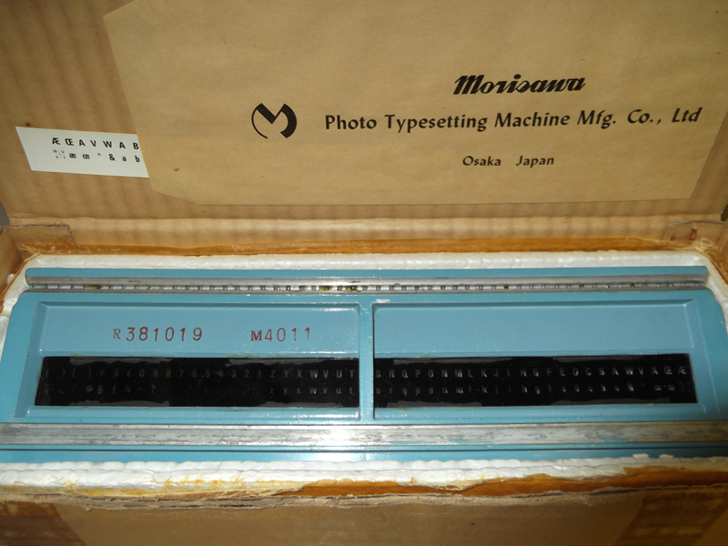
Film font for a Morisawa phototypesetting system, circa mid-1960s. Photo by Flickr user @themostinept, December 2012. License: Creative Commons — Attribution-ShareAlike 2.0 Generic https://creativecommons.org/licenses/by-sa/2.0/.
Sha-Ken had no interest whatsoever in PostScript, and scoffed at the notion that desktop publishing could ever replace traditional typesetting. Morisawa, on the other hand, was intrigued. Considering the history between the two companies, the disparity in response was hardly surprising.
Nobuo Morisawa, born in 1901, came from humble beginnings and had little formal education; what he did have was a knack for tinkering with machines. In 1923, he went to work at Hajime Hoshi’s pharmaceutical company, and was tasked with assembling a rotary printing press acquired from Germany. According to an account by Makoto Watanabe, a Japanese typographer based in Berlin, the press had been broken down and packed in thirty cardboard boxes for shipping. Without printed instructions or assistance from a professional installer, Morisawa was able to get the press up and running. Through that experience, he gained a unique insight into the inner workings of that press and the printing process in general, and was tapped to head up Hoshi’s in-house printing department.
Morisawa became fascinated with the idea of improving the printing process. He heard about failed attempts to produce a phototypesetting machine in Britain, and set to work designing his own phototypesetter. In 1924, 37-year-old Mokichi Ishii, a University of Tokyo graduate from a wealthy family, left a position at Kobe Steel to join Hoshi as an engineer. Although Ishii’s formal training was in the technical realm, he was also skilled at calligraphy and hand lettering. He met Morisawa at Hoshi and befriended the younger man; the two visionaries quickly realized that their interests and ambitions meshed, and planned to strike out on their own.
In 1925, Morisawa was granted a patent for his phototypesetting machine. Backed by Ishii’s family fortune, the two typographic pioneers launched the Ishii Phototypesetting Institute (which would later come to be known as Sha-Ken). Morisawa and Ishii worked together for several years and brought a phototypesetter to market, but limitations in existing offset technology, coupled with an economy and culture devastated by war, led to insurmountable disagreements between the partners. Morisawa parted ways with Ishii and began inventing machinery for industrial manufacturing — a more successful endeavor than his publishing innovations.
After World War II ended in 1945, phototypesetting became a viable tool in the publishing process, and there was a huge upswing in the printing industry. Ishii contacted Morisawa and the two resumed their collaboration. Morisawa designed new devices, while Ishii focused on designing fonts and serving as the face of the company. Unsatisfied with his role in the shadows, Morisawa broke with Ishii permanently and founded his own type-focused company.
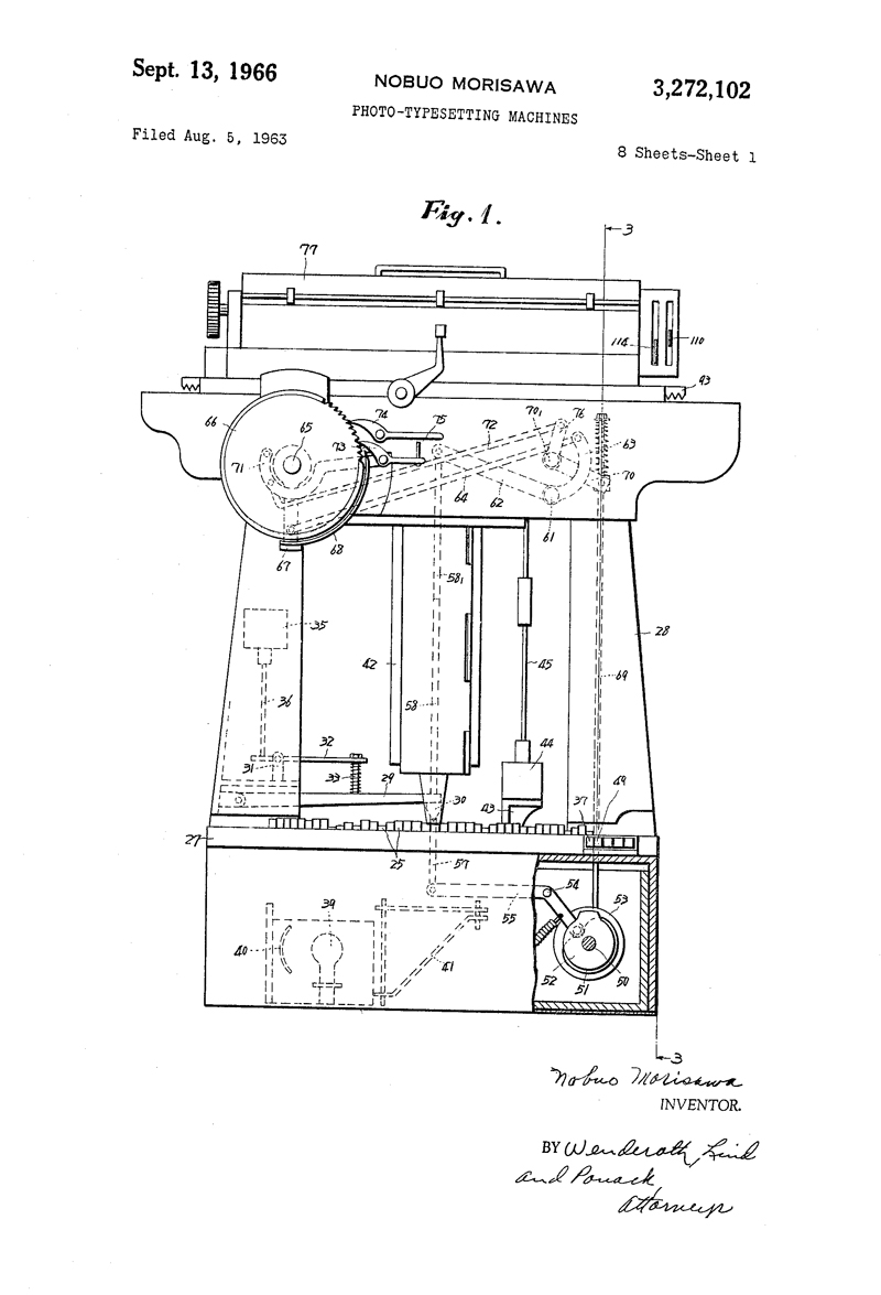
Image excerpted from a patent on a phototypesetting machine invented by Nobuo Morisawa: U.S. Patent 3,272,102, filed Aug. 5, 1963, and issued Sept. 13, 1966. Click image to view a PDF of the full patent.
Fast-forward to 1987. Sha-Ken and Morisawa were the biggest names in Japan’s type industry, but it was a lopsided competition. Morisawa had to settle for the number two spot. Although Morisawa had made numerous innovations in typesetting machines, Sha-Ken held the lion’s share of the market, due in large part to the beauty of its type offerings (including the exquisite designs crafted by Ishii himself).
“Sha-Ken was not going to license their typefaces to anybody ever — that was their position,” Stone said. “At the time, any book of any quality used the Sha-Ken typefaces, because Mr. Ishii’s font was like the Garamond — so much better than anything else.”
When Adobe came calling, Morisawa saw an opportunity to topple its longtime rival.
“Morisawa had the rest of the market and also sold typesetters in China and in Korea,” Stone said. “At the time, they had been doing business with Linotype. They sold Linotype typesetters, I think the first generation Linotronics. [They had the] contract to distribute in Japan.” Stone recalled that mutual type development efforts with Linotype didn’t really go beyond supporting the German company’s typesetting machines sold in Japan. “So they were really excited about the prospect that Adobe wanted their fonts,” Stone said.
“At the time, even then, there was a kind of a fascination with the roman letter. So when you made a font, you made the Japanese, Chinese, hiragana, katakana, and a Latin font, and you made Cyrillic; that was all in one font. And when you walk down the streets of Tokyo, you see a lot of signs in English and roman letters. They had a really interesting take on what roman letters were about — they did all kinds of stuff I had never seen before. In the late 1980s, that was already happening.” — Sumner Stone
Stone and his Adobe colleagues soon learned that business negotiations in Japan included extreme dining after a long day of meetings, and an adventurous palate was a significant asset. “They treated me extremely well every night,” he said. “They learned that I would eat weird food, so every night they would take me to something a little weirder than before. We got to the point where the guys that took me out wouldn’t eat what I was eating. That gave me some capital with them — no question!”
Stone told Morisawa Adobe would give them software and train their team to digitize fonts they already had, with the proviso that the digitized fonts would be licensed for use in PostScript printers. Min Wang and Brian Wu, Yale design students studying under Alvin Eisenman, were put to the task of digitizing Japanese fonts as interns.
“Alvin clearly thought they were good candidates for this,” Stone said. “They came on one of their Christmas vacations. I said: ‘What we have to do is digitize a bunch of characters, convince the Japanese they are good enough for them to buy the whole package.’ They digitized [them] all! The Morisawa guys came to Adobe and they were impressed, so we made the deal.”
“I was really the guy from Adobe who was basically trying to buy stuff from them,” Stone said. “Finally, to close the contract, I convinced Chuck Geschke, and maybe Steve, a couple of people from Adobe other than me [to go], and we finally signed the contract when we went over there. I remember getting drunk on sake and throwing up. I was so relieved I had it all tied up. That was a big deal.”
It was a big deal indeed. Since PostScript was designed to accommodate 256 glyphs, Adobe had to modify its software to work with Japanese fonts, which can hold 10–20,000 characters. With the Morisawa agreement firmly in place and a new capability to support extensive character sets, PostScript had a firm foothold in Japan, paving the way for further licensing agreements with printer engine manufacturers. Adobe rapidly added Japanese companies like Canon, Epson, and Sony to its roster of partners.
Stone recalled that, when he left Adobe in 1990, the company’s typographic focus in Japan had not yet progressed to original design; the focus was on digitizing Morisawa’s existing fonts.
“[Adobe] had digitized some faces but had not yet hired [Taro] Yamamoto and [Masahiko] Kozuka away from Morisawa,” Stone said. “Morisawa, they did some interesting things. They published these calendars every year — extremely beautiful productions of historical examples of manuscripts of typography from around the world. Beautifully done. [They had a] very interesting collection of typographic treasures from Asia particularly, of course. But they did not seem to be able to do much innovation where the type design was concerned. Mr. Kozuka was it. There were other people around who were doing things that were probably more interesting than he had an opportunity to do at Morisawa.”
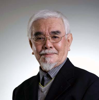
Masahiko Kozuka, former Director of Japanese Typography for Adobe. Photo by Kazushi Yoshinaga, provided courtesy of Morisawa Inc.
“We hired several people here in California who had some kind of a clue about Japanese, and several of us who didn’t have a clue got pulled into it also. I helped some,” said David Lemon, Senior Manager of Type Development at Adobe. “We did a bunch of engineering work and so forth and got it so that we could have some Morisawa fonts running in PostScript printers. By then, the Originals program was up and rolling in the US and it was clear that there were probably some advantages to Adobe having some Japanese fonts of its own.”
Adobe opened an office in Japan and began establishing a presence there. “It was mainly a sales and support office, but they started hiring some developers there and building a font team in Japan,” Lemon said. In 1992, Taro Yamamoto, a 1983 graduate of Musashino Art University who had been working in type development with Morisawa, was hired by Adobe as Manager of Japanese Typography.
“When I entered the university in Tokyo, I learned I was very interested in typography because it seems to be based on a very historical background as well as the very latest technology. Typographic design requires you to think rationally, and I think there needs to be a balance between rational thinking and aesthetic judgment. I was interested in the mixture of the two in typography.” — Taro Yamamoto
“A group of type management people — including Dan Mills — approached me because, about five years before I joined Adobe, Adobe started business relations with Morisawa to build the first Japanese PostScript printer,” Yamamoto said. “I knew them very well, including Sumner Stone, [although] he quit before I joined. I knew the people in the Adobe Type group very well. I knew Adobe was interested in building its own Japanese fonts. Masahiko Kozuka was also working for Morisawa in those days. He used to work for Mainichi Newspapers, a nationwide newspaper publisher. [He was their] typography director for more than 35 years.”
Initially, Yamamoto’s primary role at Adobe had been to make plans for Morisawa and its existing typefaces under the supervision of Kozuka. But Adobe wanted to develop its own Japanese fonts and approached the esteemed designer. “I guess Adobe thought it was a good idea to invite Kozuka to the first Japanese type team meeting in Tokyo,” Yamamoto said. “Two months after I joined, Mr. Kozuka joined Adobe. Under his supervision, we started to form a group of type designers. That happened in 1992.”
“Just as Adobe hired Sumner Stone originally to lead the font team in California, they hired Masahiko Kozuka to lead the font team in Japan,” Lemon said. “They had a reasonably-sized team — I think it was maybe ten to twelve people. That team worked with tools that Adobe developed; we were using our own tools for the Western fonts as well. We weren’t doing any of this stuff in Fontographer — it was all tools Adobe had created. We realized what a challenge Japanese fonts were, and developed some tools specifically for making ideographic fonts halfway reasonable.”
Stone said he was not surprised that Adobe was able to lure Kozuka away from Morisawa. “It was a much more appealing environment for him in the sense of supporting creativity,” Stone said. “That was probably a big attraction; he was one of the big experts.”
Kozuka alone could not handle the immense workload required to bring original Japanese typefaces to market. “We needed to hire some new people,” Yamamoto said. “[It was] hard to find skilled type designers at the time, so we decided to hire young contractors who did not have much experience and skill.” Kozuka and Yamamoto developed a set of procedures and processes to educate new designers, enabling them to systematically design Japanese scripts under the direction of Kozuka.
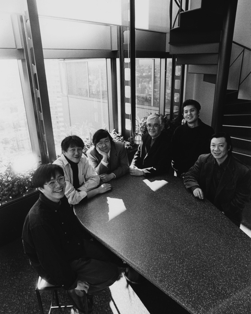
Adobe’s Japanese type team in the early days, pictured from left to right: Yutaka Ozawa, Masataka Hattori, Taro Yamamoto, Masahiko Kozuka, Isao Suzuki, and the late Akihiko Yamamoto. ASJ offices, Yebisu, Tokyo, circa 1997.
“As you know, there are many characters to be made in a Japanese font — about 9,000 characters needed to be made,” Yamamoto said. “We needed to hire some draftsmen, and one or two experienced designers. Most of the team members were young designers who had graduated from art school two or three years before.”
Yamamoto recalled introducing a radical change in font production techniques in the genesis of Adobe Type Japan. “At that time, usually in Japan designers used pen and ink to draw artwork,” he said. “We abandoned that kind of traditional method. With a handful of Adobe’s software engineers, we developed a new tool to combine and synthesize Japanese character strokes, define each shape’s variations. We used a multiple master typeface technique to make each stroke shape variable, and with the variable strokes, we could design Japanese characters. That was one technological gem at the time.”
The team became highly skilled in using this stroke-based technology — its systematic approach allowed Adobe Japan to build six weights of a font efficiently with a small team of type designers. “If you look at a typical type designing group in Japanese type foundries in those days, there are many people,” Yamamoto said. “We could produce work with a minimum of people.”
The new tools offered opportunity to work more efficiently, but also to radically depart from familiar design principles. Case in point were Kozuka’s namesake type families, the first Japanese designs in the Adobe Originals library: Kozuka Mincho, released in 1997, and Kozuka Gothic, released in 2001.
“Kozuka-san’s idea was that his first design for the Mincho style should be designed consistently with the Gothic typeface. In each typeface family, consistency can be guaranteed by applying a rational designing method using a tool,” Yamamoto said. “From today’s viewpoints, it can be said that I was young at the time. So I attempted, and also Kozuka-san, the new technology of PostScript at the time. We tended to be too ambitious about the design; we tried to make a completely new design when we first tried to make Kozuka Mincho. It seems the result may be too modernist, too rationalist. So we have designed some standard kana fonts. The intention was to weaken the too-ambitious, too-radical attitude in the first design. By using the old text and display and Gothic combined, it appears more traditional. These additions made these typefaces more useful and flexible than before, able to support a wider range of applications.”
Ryoko Nishizuka, Senior Type Designer for Adobe. Photo by Masataka Hattori.
Also involved in the development of the Kozuka types was Ryoko Nishizuka. Another graduate of Musashino Art University and a Morisawa alum, Nishizuka joined Adobe Type Japan in 1997. Although her type design career is brief when compared to that of her mentor, Kozuka, she has worked diligently to create a varied portfolio of typeface designs. Her Ryo Text, Display, and Gothic families were published through the Originals program in 2003–2004.
Nishizuka, who took the reins as Senior Type Designer after Kozuka retired from Adobe in 2001, completed a typographic labor of love in 2010: Kazuraki. Inspired by the calligraphy of twelfth-century artist and poet Fujiwara-no-Teika, Kazuraki was the first OpenType Japanese font to be fully proportional in both writing directions. Nishizuka had been working to perfect Kazuraki since its precursor, Teika, won the Silver Prize in the Kanji category in the 2002 Morisawa Typeface Design Competition. Although considered a kana font with a full complement of hiragana and katakana glyphs, Kazuraki also features more than 1,000 glyphs for kanji, symbols, and punctuation. To enhance typographic flow in vertical setting, the design also features 50 vertical multi-character hiragana ligatures.
Kazuraki, a design by Ryoko Nishizuka, based on the handwriting of twelfth-century artist and poet Fujiwara-no-Teika.
“Ryoko designed, to my non-Japanese eye, one of the most beautiful Japanese fonts ever made,” Lemon said. “Kazuraki is revolutionary because it’s based on the writing of Fujiwara-no-Teika, a twelfth-century court poet who kept more than forty years of diaries which are considered a national treasure. She captured the essence of his writing in this design and, to do that, she had to go back, sort of like what Carol [Twombly] did in a way with Trajan, Charlemagne, and Lithos, to stuff that predates type.”
Kazuraki is completely proportional and entirely vertical because that’s the way people wrote, Lemon said. “It includes a bunch of vertical ligatures which are natural in handwritten Japanese, but unheard of in a Japanese typeface. We broke a lot of software with this; we were going to ship it with CS 4, but had to wait until CS 6. We broke Microsoft Word; made stupid assumptions that are never specified anywhere about Japanese. I’m glad a lot of stuff got fixed — because of this, you can actually use Kazuraki. God, it’s beautiful.”
Considering the small size of Adobe’s type team in Japan — just three full-time staff — the amount of work produced is tremendous. Along with Yamamoto and Nishizuka, Masataka Hattori rounds out the close-knit core group. A 1994 graduate of Aichi Prefectural University of Fine Arts and Music, he just celebrated his twentieth anniversary with Adobe. As senior designer of Japanese typography, Hattori has been a key contributor to Originals projects like Kozuka and Kazuraki, his extensive skills in tools and processes essential to the successful development of complicated type families.
Adobe Type Japan’s most recent project, Source Han Sans, is a new open source Pan-CJK family. The Adobe Type team worked with Google and foundry partners in Japan, Korea and China in developing these region-wide fonts. “Because many of the Chinese characters are shared between China, Korea, and Japan, roughly half of the Chinese characters work across these locales,” Lemon said. “For some purposes, if you need to support more than one of those locales, you’re better off using a font that shares the characters. We worked on Source Han with a focus on the small screen — unsurprisingly, especially since this was funded by Google.”
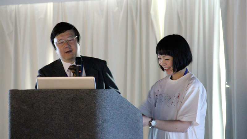
Taro Yamamoto and Ryoko Nishizuka presenting at ATypI Hong Kong in 2012. Photo by Kunihiko Okano, Shotype.
Nishizuka led the in-house team on the project, a seven-weight family boasting nearly half a million glyphs. “Her designs are based on her work on Kozuka Mincho and Gothic, with some significant modifications,” Lemon said. “Ryoko started with her kana and reworked it substantially for this project. At least in the Japanese-facing part of the font, she has a significant voice. She’s starting to get to really stretch her wings.”
In developing Kazuraki and Source Han Sans, Nishizuka held fast to the typographic ideals espoused by Yamamoto. “Our two main principles in designing a new font are key: it should have some technological innovation, but it should also have some charm, purely from a typographical viewpoint,” Yamamoto said. “The balance between the two is important.”
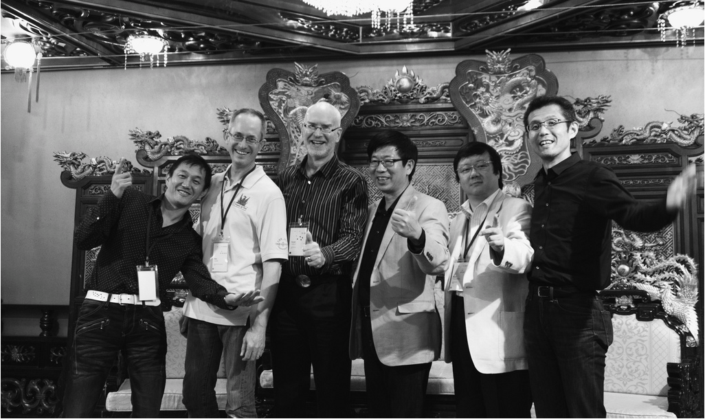
Some current and former members of Adobe’s Asian type team, pictured from left to right: Masataka Hattori, Ken Lunde, David Lemon, Min Wang, Taro Yamamoto, and Isao Suzuki. ATypI 2012, Hong Kong.
Up next: The Tao of OpenType: Another typographic game-changer from Adobe. Keep up with the Adobe Originals celebration via RSS by bookmarking this series. And, in case you missed any posts, check out the rest of the series!
2 Responses
Comments are closed.
Adobe Photoshop ,I like it.
Great series. Thank you!